At the start of 2000, life seemed great, and the future looked rosy. My son was about to be born, my daughter was about to start primary school, I was CEO of a tech start-up that was about to list on the ASX in the frenzy of the ‘dot-com’ boom, Sydney was about to host the Olympics at the apex of pre-‘9/11’ global peace and prosperity, Clinton was in the White house, Howard was PM, both were running budget surpluses (!) and paying off government debts (!!), and I was still 82 kilos (had been since age 20).
On the downside - Aussie shares were looking sick. Mining was dead, China was still dirt poor before the start of its urbanisation / industrialisation / export boom, commodities were cheap, the AUD was about to drop to 55 US cents, and my future good friend Ian Macfarlane, as then RBA Governor, had just sold off 167 tonnes of gold (5.34 million ounces, two-thirds Australia’s gold reserves) at a dirt-cheap US$350 per ounce because the RBA saw gold as an irrelevant relic from an ancient time. Australian shares, miners, currency, and commodities (and banks) were all deeply out of fashion in the shiny, new, high-tech world of the future.
At that time I was not worried about long-term investing – I was too busy getting our start-up ready for IPO. The tech boom would last forever, right?
Things change!
In the 25 years since that glorious time, returns from the main investment asset classes turned out very differently to how they looked at the start. A great reminder that things can change, radically and quickly.
Today’s chart shows returns from a dozen main long-term asset classes. The lines show cumulative total returns (ie capital gains plus income) from a common base at the start of January 2000, to the end of December 2024.
To the right I show the average annual nominal returns and real returns after Australian CPI inflation.
(The benchmark indexes for each asset class are included at the end of this story. Returns on foreign assets are in either hedged or unhedged AUD, as marked. All returns are before fees, costs, taxes, and fund ‘alpha’. Don’t laugh – some people still assume/prey for fund alpha!).
[ First - a quick note on semantics before I get complaints about when a ‘century’ starts and ends. For me, a ‘century’ means 100 years, so a ‘quarter of a century’ means 25 years. For me, the ‘2000s’ started with the year ‘2000’, and from the start of 2000 to the end of 2024 I count 25 years – ie a quarter of a century. So this story is about the 25 years (quarter of a century) from the start of 2000 to the end of 2024.]
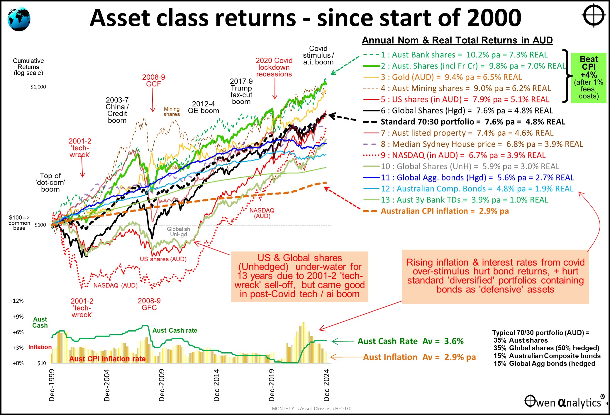
The lower section shows Australian inflation (orange bars) and the Australian cash rate (green line).
Inflation started at just 1.8% at the end of 1999, spiked temporarily to 6.1% in the September quarter 2000 (caused by the introduction of 10% GST in Australia in July 2000), but inflation went into negative in the 2020 Covid lockdown crisis, then surged to 7.9% in 2022. Average inflation rate over the 25 years was 2.9% (ie within the RBA’s 2-3% range).
The RBA cash rate started at 5%, peaked at 7.25% in 2008, then from the GFC was cut progressively to 0.1% in the Covid lockdown crisis, then finally rose in 2022 and 2023 to 4.35% to attack inflation.
What were the best and worst asset classes over the past 25 years?
US shares – the big losers initially, but clawed back in the recent boom
I’ll start with the US share market as it was the star of the 1990s ‘dot-com’ tech boom. It is a good example of how the stars of one decade can quickly turn into the dogs of the next decade.
The 1990s was virtually a decade-long straight line upward for the US share market. At the start of the 2000s, the boom looked and felt like it would last forever but, like all booms, quickly collapsed.
It wasn’t just the over-hyped and over-priced ‘dot-com’ stocks that collapsed. The NASDAQ composite fell by -75% and the S&P500 index fell by -47%, plunging the entire US economy into its deepest economic recession since the 1930s Great Depression. A dramatic change in just a couple of years from the top of the boom that felt like it would last forever. (same as today!)
The chart shows the deep retractions in un-hedged AUD terms for Aussie investors – NASDAQ (red dots), and S&P500 (red line). Because of the heavy weighting of US shares in global indexes, they also dragged down un-hedged global shares (grey line), and hedged global shares (heavy black line). The 2001-2 ‘tech-wreck’ kept US and global shares (in AUD) underwater for more than a decade until they finally clawed their way into positive territory in 2013.
Fortunately, 25 years is a long enough time for one boom to end and another to arise from the ashes. In recent years, the latest US-led tech boom (driven by social media and ‘a.i.’ this time) has driven US and global share indexes higher again, but still not enough to catch up to the relatively boring-looking Australian share market.
Even after the recent US-led global tech boom, US and global share markets still ended the 25-year period with rather poor overall returns – unhedged US shares = 5.1% pa real, Global hedged shares = 4.8% real, unhedged NASDAQ = 3.9% real, and unhedged Global shares = 3.0% real.
These are all well below average, and not far above bonds – which were also poor (see below).
Australian shares
Meanwhile, the Australian share market was the clear winner. How?
The Australian share market was very much out of favour in the 1990s tech boom. The ASX was dominated by two out-of-favour, old-world sectors - the century-plus-old dinosaur banks, and the century-plus-old big miners.
Two of the big-4 banks (Westpac and ANZ) almost blew themselves up in self-inflicted orgies of bad lending and disastrous overseas misadventures (NAB as well) in the 1980s deregulation boom, and by the 1990s they were only just getting over the resultant losses. (Ex-government department CBA was the smallest of the big-4 when it was privatised in 1991.)
The miners were in the doldrums with the 20-year collapse in commodities prices. Who needs old-world commodities miners in the brand new high-tech world where everything is going to be done on the new-fangled internet?
Australia had a very small tech sector. The two largest stocks on the ASX were Telstra and News Corp – both aging dinosaurs, dressed up as ‘tech stocks’ at ridiculous prices. (Even today, prices of both are nowhere near their crazy dot-com peaks, 25 years later).
So why has the Australian share market beaten the US market over the past 25 years by a big margin?
Three reasons. First, because we had virtually no tech sector, the overall market did not crash like the US market (and UK, Germany, and Japan, which also had massive tech booms/busts).
Banks
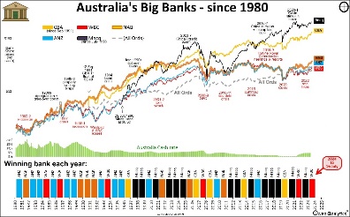
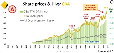
Second - the banks got over their disasters of the 1980s and 1990s, survived the GFC relatively unscathed (unlike the US banking disasters in the GFC), then made a collective killing, milking their price-gouging oligopoly cartel by maximising margins and fees ever since. The bank regulator APRA forced them to carry truck-loads of extra capital for safety, and the Hayne Royal Commission forced them to clean out (some of) their illegal practices and get rid of their non-core businesses.
The problem is that incredible rise bank share prices in recent years, which lifted the ASX to its current lofty heights, has left the big banks vastly over-priced all fundamentals, whichever way you look at it.
Things change!
See links to my recent stories on the Aussie banks – at the end of this story.
Miners & the rise of China
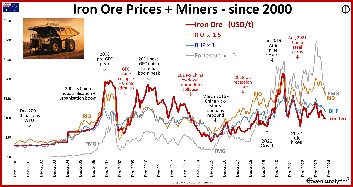
Third – China’s entry into the World Trade Organisation in 2001 kicked off its incredible urbanisation, industrialisation, and export booms that put a rocket under commodities prices and volumes – directly benefiting the Aussie miners.
China’s growth for the first 20 years of this century was by far the greatest single contributor to Australia’s wealth, prosperity, living standards, to State and Federal government tax revenues, and also the largest contributor to the growth in aggregate revenues, profits, and dividends on the ASX.
The problem is that China’s incredible construction-led growth is now over. Things change!
Gold
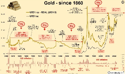
By the late 1990s, inflation had allegedly been ‘solved’, the gold price had more than halved from its 1980 peak, and central banks were selling down their reserves of gold – including the RBA. ‘Fiscal responsibility’ was back in favour, and Bill Clinton even ran three consecutive US budget surpluses in the late 1990s, for the first time since the early 1950s.
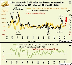
But things change. Inflation returned everywhere after the excess fiscal and monetary stimulus in Covid, and gold has revived as a potential inflation hedge favoured by investors in a world of runaway government deficits and debts. Central banks are buying up gold again to reduce their reliance on US dollars, especially in countries run by autocrats, who watched in horror as the US government seized Russia’s US dollar assets after it invaded Ukraine in 2022.
Bonds clobbered by the return of inflation
The fate of bonds is another example of sudden change in the world – from the late 1990s when inflation was supposedly ‘solved’, when governments were running surpluses and paying off debts, to the recent years of resurgent, and now ‘sticky’ inflation, with governments running up massive deficits and debts.
When inflation and interest rates were declining from the early 1980s through to the GFC and Covid, bonds posted unusually high returns, almost as good as share market returns, but with much lower volatility.
Unfortunately, those great returns and low volatility ended when inflation roared back in 2021, clobbering the returns on bonds. In 2022, bond markets suffered their worst returns in a century, which brought down their overall average returns over the 25-year period. Inflation has not been miraculously ‘solved’.
Sydney House prices
Although residential housing is not really a comparable, investible ‘asset class’ for some purposes (and the concept of ‘median’ has a host of problems), I include it here as housing is the main source of 'wealth' in Australia. I use Sydney prices as it is relevant to most advisers and clients that use my work directly or indirectly, and it is the most common headline number used in the chartering media.
The Sydney median house price rose by a healthy 6.8% per year over the period, or 3.9% pa after inflation. The median price rose from a rather cheap-sounding $265k to $1.36 million today. That four-fold increase sounds like a lot, but it was not a patch the tremendous returns from local share market.
Typical 70:30 ‘diversified’ portfolio
I also include a typical 70/30 portfolio (70% ‘growth’ / 30% ‘defensive’), because that is the basis of most of the money in the ‘Superannuation’ (retirement) fund system in Australia, including ‘industry’, ‘retail’, and ‘corporate’ super funds.
In the typical 70/30 portfolio (for Aussie investors) - the 70% ‘growth’ side is usually split more or less half-half between Australian and international shares. Here I use 35% Australian shares, 35% Global shares (50% of which is hedged). The 30% ‘defensive’ side is usually split around half-half between Australian and global bonds. Here I use 15% Australian Composite bonds, and 15% Global Aggregate bonds (hedged).
In the case of bonds – the Australian ‘Composite’ bond index and the Global ‘Aggregate’ bond index each include a mix of ‘investment grade’ bonds issued by a range of borrowers including governments, semi-governments/States, corporates, as well as asset-backed bonds, eg mortgage-backed securities.
Our benchmark ‘70/30’ portfolio returns are before fees, and assume no ‘alpha’, and no asset allocation changes, just setting the initial ‘strategic’ asset allocation and then regularly re-balancing to the target allocations.
On the chart we see that the standard 70/30 portfolio achieved average returns 7.6% per year nominal, or 4.8% after inflation. This is below our standard net ‘CPI+4%’ goal (gross CPI+5% less 1% for fees, costs, taxes – see below).
There are two main reasons for this rather poor result – the poor US/global share returns due to the massive 2001-2 ‘tech-wreck’ losses, and the poor bond returns due to losses in 2021 and 2022.
Private assets, Hedge funds, Crypto?
Although ‘private assets’ are the hot topic all over the media these days, I have not included them here. ‘Private assets’ usually include three main types - ‘Private Equity’, ‘Venture Capital’, ‘Private Credit’. Nor have I included hedge funds. They are not regular asset classes available for ordinary investors.
Most ‘Private Equity’, ‘Venture Capital’, and ‘Hedge’ funds tend to have features that are not suitable to most investors. These include:
-
-
- High entry levels (most are $10m or more),
- Most have lock-up periods of many years (usually 7 to 10 years),
- P/E and V/C funds usually have ‘capital calls’ that require investors to put in more money over time,
- they tend to have opaque (and usually fudged) internal valuation processes (they mark their own homework),
- hidden layers of leverage, derivatives, counterparty risks
- riddled with hidden conflicts of interest,
- benchmark indexes are self-selected (funds choose not to post bad returns or collapsed funds)
It is true that there are a few ‘retail’ structures that are marketed to ordinary investors, but these tend to be just even more expensive versions of wholesale funds, usually with additional layers of hidden costs and risks.
‘Private Credit’ (also called ‘Private Debt’) is essentially non-bank lending – ie lending directly to corporate borrowers that are rejected by banks. Although institutional non-bank lending has been around for centuries (mainly life insurers lending directly to companies), ‘retail’ Private Credit fund structures are very recent, and became popular with yield-hungry retail investors, especially during the zero interest rate Covid years.
Private credit also suffers problems of illiquidity, high fees, opaque accounting, fudged internal valuations, conflicts of interest, hidden layers of leverage, and concentrated exposures – especially to property developers. When retail Private Credit has survived through a few cycles I will include it in long term returns.
Crypto?
Crypto spruikers will no doubt complain that I have not included bitcoin, other crypto’s, NFTs, etc in this summary of asset class returns. I have not included bitcoin as it does not have a return history over the period covered, and it has not yet lived up to its lofty promise of being a legitimate payment system for general use (apart from by drug dealers, ransomware hackers, illegal arms dealers, and money launderers).
Call me old-school, but this analysis is restricted to long-term asset classes with deep markets and long histories of performance through a variety of cycles and market conditions – the types of things used by serious long-term funds – like charities, endowments, family offices that have been around for decades, and plan to be around for decades in the future.
Net CPI+4% return target
The standard starting point for long-term wealth generation, retirement planning, and perpetual institutions like charities, is a long-term net return goal of CPI+4% per year. For most purposes, a net return of CPI+4% means a gross CPI+5%, allowing for up to 1% in fees, costs, taxes.
A portfolio returning an average of net CPI+4% provides the confidence to withdraw 4% of the balance per year and have a pretty good chance that your portfolio will outlive you, maintaining the real value of capital, and the real value of withdrawals, through all sorts of market conditions along the way. Many perpetual charities have a regulated minimum 5% spend rate, which requires a net CPI+5% return goal, which is even tougher than net CPI+4%.
On the upper right side of the chart we can see that over the past 25 years, only the top 5 asset types on the chart managed to achieve this critical gross CPI+5% net return target (or net CPI+4%).
Three of those were Australian shares, so it was basically just Australian shares, gold, and unhedged US shares (S&P500).
Critically, hedged and unhedged global shares didn’t achieve the basic net CPI+4% goal over the 25 years. That's a long time for 'below average' returns.
Current status?
From the start of 2000, how have things gone?
Our little dot-com (ASX:WSX) was floated in early 2000, literally a week before the start of the global ‘tech-wreck’ (timing is everything!). The share price crashed, along with all of the other newly-minted dot-coms. We closed the cash-flow negative operations, and used the IPO cash to buy up cash-flow positive businesses, changed the name (to Tribeca Learning, ASX:TBC), built it up, made profits and even paid dividends (!), then sold it to Kaplan (Washington Post, Berkshire Hathaway). This formed the basis of Kaplan Learning Australia, which has grown to be largest trainer of financial professionals in Australia.
My son turns 25 this year, he is a software engineer at a global tech giant (and part-time muso), and he is currently swanning around Japan. My daughter is a senior fashion buyer at a leading online fashion house (and part-time DJ), and is currently on honeymoon, somewere between Zanzibar and Morocco.
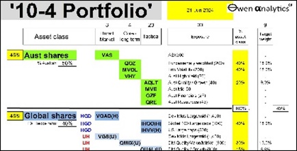
My long-term ’10-4’ ETF portfolio is here (has been over-weight Gold and US shares).
And I’m still 82 kilos!
The next 25 years?
One thing is certain - things change! Things that did well for the past year, or decade, or several decades, will reverse for reasons we can’t even see now. Even the 'best' asset classes can generate below-average returns for decades at a time.
Conditions and assumptions we take for granted now without a second thought, will suddenly be abandoned. Booms will always turn to busts, but there will always be another boom, and another.
Things that were out of favour and un-loved, will rise again in future – for whole new reasons we don’t even comprehend now.
Just because Australian shares and gold were the clear winners so far in the new century, this will almost certainly guarantee that they will be on the losing side in the next few decades. This story is certainly not an advertisement for Aussie shares and gold. More likely a warning!
Look out for my next story in a few days that compares the returns from the most recent 25 years to the last few decades of the 20th century. Spoiler alert – the winners and losers were very different - Things change!
‘Till next time – safe investing!
Further reading -
On the US share market -
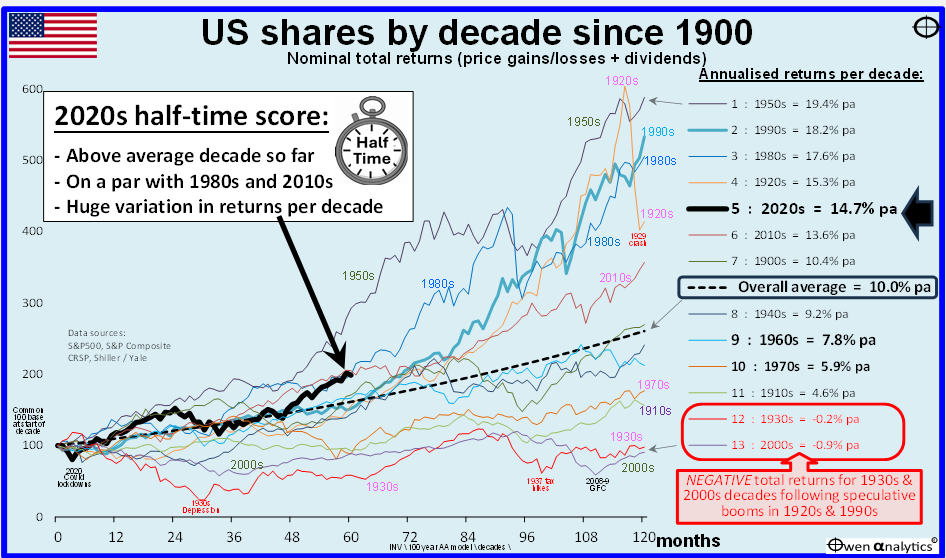
On the current very expensive pricing of the US share market:
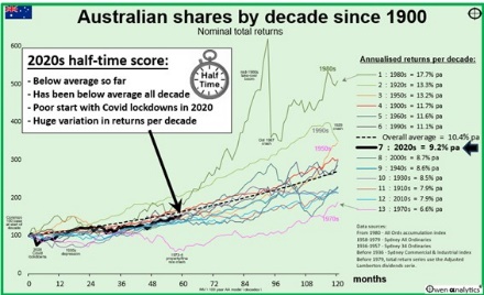
On Australian shares -
On the ascent and over-pricing of Australia’s big banks:
On Australia’s mining sector revival – see -
On Gold -
For my current long-term ETF portfolio, including being over-weight US share and gold - see -
Asset classes and sectors, and benchmark index for each:
|
Asset Class
|
Sector / Segment
|
Benchmark index
|
|
Australian Shares
|
ASX 200 (including franking credits)
|
S&P/ASX200 Franking Credit Adjusted Tax-Exempt TR
|
|
Australian Financials (‘banks’)
|
S&P/ASX 200 Financials Ex-A-REIT TR
|
|
Australian Resources (‘miners’)
|
S&P/ASX 200 Resources TR
|
|
Aust Small companies
|
S&P/ASX Small Ordinaries TR
|
|
Global shares
|
Developed World Shares Hedged
|
MSCI World 990100 net TR Hgd AUD
|
|
Developed World Shares Unhedged
|
MSCI World 990100 net TR AUD
|
|
Developed World Small companies Hedged
|
MSCI World Small Cap 106230 net TR
|
|
US Shares Unhedged
|
S&P500 TR AUD
|
|
Emerging Markets Shares Unhedged
|
MSCI Emerging Markets 891800 net TR in AUD
|
|
Property & Infrastructure
|
Australian REITs
|
S&P/ASX 200 A-REIT TR
|
|
Aust Unlisted Property funds
|
MSCI Mercer Australian Core W/s PFI and predecessors
|
|
Global REITs Hedged
|
FTSE EPRA Nareit Developed ex Australia Rental Index AUD Hedged - TRAHRA
|
|
Global listed Infrastructure Hedged
|
FTSE Developed Core Infra 50/50 Hgd AUD FDCICAHN
|
|
Alternatives
|
Global Hedge Funds Unhedged
|
HFRI Fund-weighted Composite index AUD
|
|
Gold Unhedged AUD
|
London PM Fix in spot AUD
|
|
USD cash (unhedged AUD)
|
US 3m T-Bills in AUD
|
|
Fixed/floating income (debt)
|
Australian Government bonds
|
Bloomberg AusBond Treasury 0+ Yr Index
|
|
Australian investment grade Corporate Bonds
|
iBoxx AUD Corporates Yield Plus Mid Price Index
|
|
Global Government bonds Hedged
|
Bloomberg Global Treasury Scaled Index Hgd AUD
|
|
Global investment grade Corp bonds Hedged
|
Bloomberg Global Aggregate Corporate and Government-Related Scaled Index Hgd AUD
|
|
Global High Yield bonds Hedged
|
Markit iBoxx Global Developed Markets Liquid High Yield Capped Index (AUD Hedged)
|
|
Emerging Markets Bonds Hedged
|
J.P. Morgan EMBI Global Core Index (AUD Hedged)
|
|
Australian Hybrids (grossed up)
|
Solactive Australian Hybrid Securities Index (Gross)
|
|
Cash
|
Australian Cash
|
RBA cash target
|