Saturday, January 18, 2025

linkedIn twitter

2020s decade half-time score – US shares: great so far, but expect a decade of pain when boom ends

23 Dec 2024 26 day(s) ago 9 Comments

Last week I looked at the 2020s decade half-time score for Aussie shares and the picture was not very good.

Today, we look at the decade half-time score for US shares. 

  • At the half-way mark, US shares are doing well above average.  
  • The current speculative boom is similar to the 1920s and 1990s booms, but they were both followed by a decade of NEGATIVE total returns in the 1930s and 2000s when those booms collapsed.
  • But markets don’t crash because or when they are expensive. The current boom may run on for years.
(a note on terminology - when does a 'decade' start?)

First a note about terminology, given the feedback I have received. For me a 'decade' starts on the first day the name of the decade is in the date itself.

For example, I take the '2000s' to have started at the start of the year 2000 (ie the first day that had a 2000 in the date - ie 1 Jan 2000). On that basis, I regard Covid (Feb-Mar 2020) as occurring in the '2020s' decade, because the date was Feb 2020, not the '2010s'. For me the '2010s' ended at the end of 2019, just like the '1990s' decade ended with 31 Dec 1999. 

So on that basis we have had 5 full years of the 2020s so far - ie 2020, 2021, 2022, 2023, and 2024. And for me, 5 years is half a decade. And there are 5 years left in the '2000s' - ie 2025, 2026, 2027, 2028, 2029. (The following year, '2030', is the first year of the '2030s' because 1 Jan 2030 has '2030' in the date), etc. 

So, because at the end of 2024 we have had 5 full years of the 2020s since 1 Jan 2020, we have are half-way through the 2020s. That's how I figure it, but each to his/her own! 

2020s decade – above average

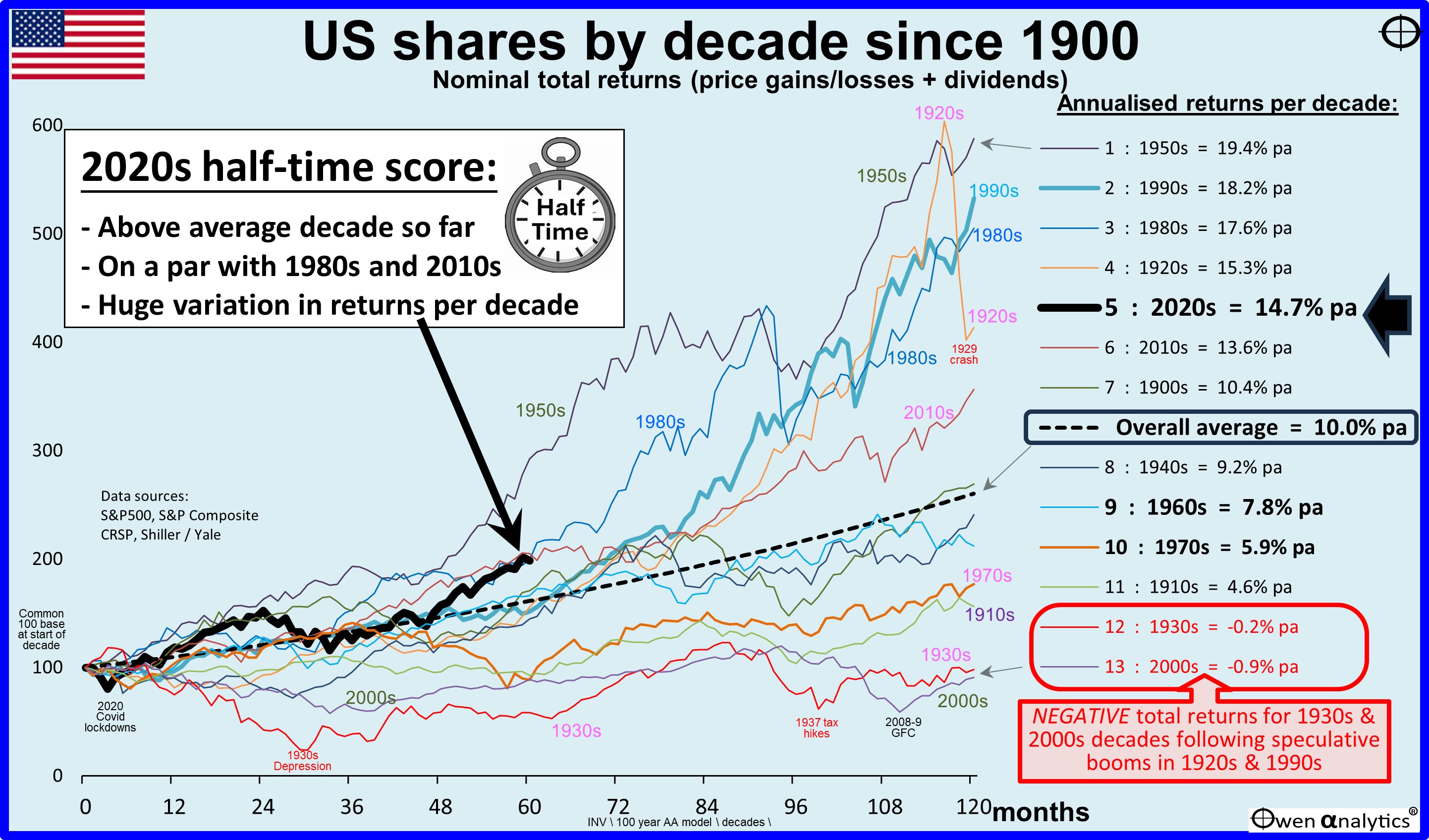
While Australia has been having a below-average decade so far, the US market (heavy black line) is posting great returns averaging 14.7% per year so far (or 100% in total). This is well above the overall average decade return for the US market of 10% pa (black dashes).

Best decades for US shares

The best decade for US shares since 1900 was the 1950s – with a total return of 488% for the decade, or an extraordinary 19.4% per year. That was the era of the tremendous post-war Eisenhower nation-building infrastructure spending boom and the Sputnik space race, but it also included the Korean War inflation, the Suez Crisis, and economic recessions 1953-4 and 1957-8.  

The 1980s was also a strong decade for US shares, driven by Reagan’s deregulation reforms and tax cuts, after recovering from the early 1980s Volcker inflation-busting recessions. You can see the October 1987 crash as a dip in the line for the 1980s on the chart (at the month 95 mark), but the market quickly recovered to go on to higher levels again by the end of the decade.

The 1920s was also a strong decade. On the chart we can see that the 1920s decade was actually ahead of all decades until the 1929 crash right at the end of the decade brought it back down below the 1950s, 1990s, and 1980s lines, to finish in 4th place in terms of decade returns.

The second best decade for US shares was the 1990s, with total returns of 433% or a very high 18.2% per year on average. The 1990s started off on the wrong foot with the 1990-1 recession, but the second half of the 1990s decade was the extraordinary ‘dot-com’ tech boom, which took the market to record levels of overpricing, even more over-priced than the 1920s boom prior to the 1929 crash.

Booms never last forever of course. The two biggest booms – in the 1920s and 1990s – were both followed by very poor decades the 1930s and the 2000s. Which brings us to -   

Worst decades for US shares

The worst decade for US shares since 1900 was the 2000s decade, which was effectively the unwinding of the extraordinary 1990s dot-com boom when the market reached levels of over-pricing never seen before, including the 1920s.

The US share market (S&P500 total return index including dividends) ended up in with negative returns for the whole 2000s decade.

Also posting negative total returns for a whole decade was the 1930s - the second worst decade for US shares, thanks to the 1929-33 crash that ended the 1920s speculative boom.

Wild speculative booms are followed by busts and very poor decades

The lesson for today is that massive speculative booms – like the 1920s and 1990s - always collapse eventually, and the decade after the crashes are very poor (negative total returns for a whole decade in the 1930s following the 1920s speculative boom, and negative total returns also in the 2000s decade following the 1990s speculative boom).

The best decade for US shares – the 1950s – was followed by 7.8% pa returns in the 1960s decade. This was below average but not negative like the 1930s or 2000s decades. This was because the 1950s was not an over-priced speculative boom like the 1920s and 1990s which did end in negative returns in the following decade.  

Where are we now?

We are now in the middle of another tech boom, where the whole market is very expensive. But the broad market is still only around half as expensive relative to profits and dividends as it was at the end of the 1990s ‘dot-com’ boom.

The current boom will end in tears, of course, but what we don’t know is when. Markets don’t crash because or when they are expensive. They crash because of some trigger or set of triggers. An over-priced boom can run on for many years into even more over-priced territory until the eventual crash.

The 1990s tech boom ran for nine years without a major sell-off. The current boom is only two years old - it had sharp sell-offs in 2020 (Covid) and 2022 (Fed rate hikes). So the current boom is relatively young, and only half as expensive as the 1990s dot-com boom was before it eventually collapsed.

2025 may be the year of the big correction, but it may run on for years before the final reckoning!

As legendary investor Peter Lynch said –

“Far more money has been lost by investors preparing for corrections or trying to anticipate corrections than has been lost in corrections themselves”   

Australia -v- USA

We saw in the same exercise for Australia that the Australian market has never posted any negative total return decades – the worst decade for Australia was the 1970s with total returns averaging 6.6% pa.

The US share market has had better ‘best decades’ than Australia, but it has also had worse ‘worst decades’ than Australia, although the overall total returns over the full thirteen decades have been very similar in the two markets – around 10% pa each overall.

US share market more volatile

The US market has had higher highs and lower lows than Australia because it has been much more volatile. The annualised ‘standard deviation’ of the US share market since 1900 has been 17.5%, compared to just 13.5% for Australia (or 13.7% excluding the war-time share price controls in Australia from March 1942 to December 1946).

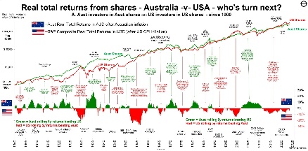
Comparing the charts for the Australian and US markets, you will notice that the decades of great returns and poor returns are the same for both Australian shares and US shares. Both work in very similar cycles – they both boom together and bust together, although the extent of the booms and busts in each country differ.

Essentially, Australia and the US take turns in having bigger booms and then bigger busts -
A graph of stock market shareDescription automatically generated with medium confidence              

Huge variation in returns in different decades

As with the chart for the Australian share market, today’s chart for the US market also highlights the huge variations in returns in different decades. Finance textbooks say that 10 years is ‘long-term’, and share funds always warn potential investors that the minimum holding period for shares is 7-10 years.

The implication is that if you should be prepared to hold for a minimum of 7-10 years because the share market  is volatile - ie result in very different outcomes over shorter holding periods. The problem is that the outcomes are very different even over 10 year holding periods, like the different decades on the chart.

Timing is everything! ‘Time-in-the-market’ only works if you pick the right decade/s

The chart shows that even 10 years is a not nearly long enough to reduce the variability of returns and provide investors with any degree of confidence that a 10 year holding period will result in returns mor or less around the long term average. Unfortunately, in the real world, the share market can generate returns well below average (or well above average) even for 20 year holding periods or more sometimes.

If you are relying on ‘time in the market’, then much of it comes down to pure luck – when you happen to have been born – which more or less determines when you start working and investing, and when you retire.

For example – if you happened to retire at the start of the 1930s or at the start of the 2000s with a pot of money to fund your lifestyle, you would have immediately faced a decade or more of very poor returns (lower lifestyles and/or run out of money sooner) in both cases.

But if you happened to retire at the start of the 1950s or at the start of the 1980s, then would have faced 20 years of significantly above average returns (better lifestyles and/or larger legacy) in each case.

That’s the great lottery of birth! But that’s too much reliance on luck for my liking!


‘Till next time, safe investing!

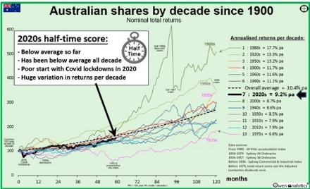
For the equivalent analysis of the Australian share market – see:
A graph showing the spread of coronavirusDescription automatically generated 


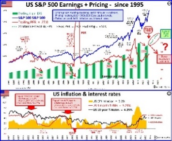
For more on the state of the US market and where we are in the current boom cycle – see:
A graph of stock pricesDescription automatically generated with medium confidence


A graph of the us sharesDescription automatically generated with medium confidence      


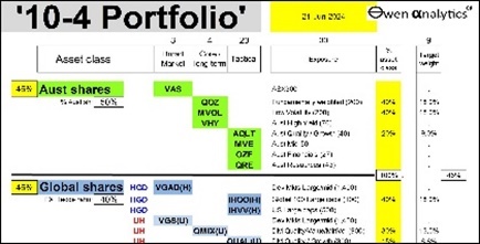
For current holdings in my long term ETF portfolio - see:
A screenshot of a computerDescription automatically generated

Or visit my web-site for 100+ recent fact-based articles on a wide range of relevant topics for inquisitive long-term investors.


Ashley Owen


Please subscribe to my Newsletter, connect on LinkedIn, or follow me on Twitter X 


Experiences


Director/Principal, Owen Analytics Pty Ltd (current)

Investment Markets Research & Analytics, Portfolio Construction & Management, Corporate Finance, Venture Capital, M&A, and IPOs. Investment Committee membership, consulting to advice firms and financial institutions.

Co-founder & Regular Contributor, Firstlinks (current)

Co-founder of Australia's leading investment and superannuation newsletter and website for industry professionals and investors.

Non-exec Director, Third Link Investment Managers (current)

Leading Australian equities fund-of-funds that donates all management fees to Australian charities. The fund has donated in excess of $21m to a range of Australian chartities since inception in 2008. 

Chief Investment Officer, Stanford Brown (past)

Responsible for managing over $2 billion AUM in multi-asset class portfolios and discretionary accounts at a privately-owned advice practice.

Director & Joint CEO at Philo Capital Advisers Pty Ltd (past)

Specialises in investment portfolio construction & management, multi-asset class asset allocation, and global macro strategies.

Check out my full bio here

9 Comments

Existing Comments

Thanks for another informative article. RE: "only half as expensive as the 1990s dot-com boom was before it eventually collapsed." Would you please unpack that by explaining what measure and market (I assume SP500 as that was example in the article) you used to come to come to the only half as expensive conclusion. Chris

chris j
December 31, 2024

thanks Chris,
it is difficult to compare levels of over-pricing in different booms because surrounding conditions can be quite different. On a variety of measures, the current tech boom appears to be less exuberant and less fundamentally over-priced than the late 1990s dot-com boom. Earlier this year (2024) I started saying that the current boom is about half the level of over-pricing than the late 1990s. But probably price rises during the year have narrowed the gap somewhat. eg. comparing the S&P500 now -v- then:
Div yields: 1.3% now -v- 1% then. P/E ratios: 30 now -v- 34 then. CAPE: 35 now -v- 46 then. Shares as % of total US asset allocation: 38% now -v- 45% then. Equity Risk Premium (earnings yield less 10y bond yield): -1.2% now -v- -3.5% then. An alternative Equity Risk Prem (earnings yield less cash rate): -1.0% -v- -1.7%. EPS versus trend: +18% now -v- +30% then.
On some other measures the two booms are similar - eg. Shares/GDP, and Margin Lending/ GDP.
Certainly getting up to that crazy dot-com level again! Either way, the end will be painful.

ashley owen
December 31, 2024

Your earlier this year comment makes things a lot clearer. I was not seeing half as expensive. I thought maybe you had some secret sauce Ash :)

The upside is it got me thinking so I did some fact checking. All time high in CAPE was Dec 1999 at 44. As of the other day CAPE was 38.

I found a good site that has links to Various Market Valuation Ratios:

https://www.gurufocus.com/economic_indicators/categories/market-trend/total-market-valuation/market-valuation-ratios

Some of your readers may find it interesting so I thought I would share.
The raw Shiller CAPE data is available for free at:
https://shillerdata.com/
A workbook with various worksheets going back decades.

Additionally:
Buffet Indicator
https://www.cmgwealth.com/ri/on-my-radar-a-mid-year-look-at-valuations-and-future-returns-better/

https://www.cmgwealth.com/ri/on-my-radar-2023-mid-year-market-valuation-update/ has various valuation metrics

https://www.cmgwealth.com/ri/on-my-radar-a-different-look-at-valuations/

https://www.cmgwealth.com/ri/on-my-radar-valuation-update-long-term-cycles-and-ai/

Chris Jackson
January 01, 2025

thanks chris. Looks like some useful sites there. I always do my own calculations from original data. (eg never use data from secondary or tertiary sources like Bloomberg that just scrape data without checking - riddled with errors - eg decimal in wrong place, missing zeros, etc). So if you/readers use other sites (including mine) I would always strongly recommend checking calculations with your own data and your own models.
cheers
ao

ashley owen
January 01, 2025

Thanks for your reasoning why real interest rates are too small.

My alternative approach is to compare the capital due to compounding interest to the CPI, both normalised to 1 at start of period of interest.

From 1982 (normalised to 1) to present:
. 0% taxed compounded interest results in capital of 17.6, whereas,
. CPI is 4.8.
Compounded interest is much greater than CPI.

From 2020 (normalised to1) to present:
. 0% taxed compounded interest results in capital of 1.12, whereas,
. CPI is 1.20
Compounded interest is less than CPI.

My hypothesis is that real interest rates will stay larger for longer until normalised compounded interest exceeds normalised CPI.
Payback of capital value lost due to inflation.

I have sent you a spreadsheet for greater clarity.

Dudley
December 24, 2024

hi dudley - your approach may be interesting. Using retail bank TD rates raises a host of additional factors - eg term premium, cost of branch networks priced into TD, banks ALM positioning, demand for lending/funding, price impact of government guarantee, etc, etc. (I was once chairman of ANZ Bank's retail pricing committee in the 1990s - set prices of all retail products weekly, plus was on the bank's ALM committee and CFO of the Retail bank).
In my story on interest rates I was not really providing 'reasoning' for why real interest rates are where they are. I was outlining what central bank thinking is - because that will determine what real interest rates are. They probably use a whole bunch of econometric models but the main problematic issue is modeling the likely outlooks for global supply & demand for savings/capital - including demographics, capex demand, trade/protection policies, fiscal policies, politics, and a whole bunch of other unmodelable things!
hope this helps!
cheers
ao

ashley owen
December 24, 2024

* correction. In my above example of Covid - I regard Covid (Feb-Mar 2020) as occurring in the 2020s decade, because the date was Feb 2020, not the '2010s'. For me the 2010s ended at the end of 2019, just like the '1990s' ended at the end of 1999.
I have now added a section at the start of the article - thanks for suggesting!
cheers

ashley owen
December 23, 2024

hi gary, thanks for the feedback. On the date thing - well I take the 2000s to start at the start of the year 2000 (ie the first day that had a 2000 in the date - ie 1 Jan 2000). So for example I regard Covid (Feb-Mar 2020) as occurring in the 2020s decade, because the date was Feb 2020, not the '1990s'. For me the 1990s ended at the end of 1999. So on that basis we have had 5 years of the 2020s - ie 2020, 2021, 2022, 2023, and 2024. And for me, 5 years is half a decade. And there are 5 years left in the 2000s - 2025, 2026, 2027, 2028, 2029. (Then 2030 is the first year of the '2030s' because it has 2030 in the date), etc. Hence the end of 2024 is half-way through the 2020s. That's how I figure it, but each to his/her own!
cheers
ao

ashley owen
December 23, 2024

Your point is well made and is a useful one to make.Thank you. However the midpoint of the 20's decade is 12 months away..not that it changes the essence of your email. I am just being technically pedantic.

Merry Christmas

Gary

Gary Buchanan
December 23, 2024

Leave a Reply

“Over the past 20 years, Ashley has been an invaluable assistance to me, as a reliable source of unbelievably strong and interesting data, and many good investment ideas.”

"The depth and quality of Ashley’s research and analysis of investment markets is the best in the business.”

Dr Don Stammer - Australia’s most respected economic writer, commentator, and speaker for the past 40 years, with a distinguished career including the Reserve Bank of Australia, Chief Economist at Deutsche Bank Australia for 21 years, chair of nine ASX companies, plus numerous non-listed and not-for-profit boards. Read more

‘For many years, Ashley has been my go-to source of information and analysis on what’s going on in financial markets and why.’

“Ashley has an encyclopaedic knowledge of the markets – I call him Mr Google!”

Noel Whittaker, AM – Australia’s best-known personal finance writer, columnist, and media commentator for the past three decades. He has written more than 20 books on personal finance, his columns appear in almost every major Australian newspaper, and he appears regularly on radio and TV as an expert on finance and investing. Noel Whittaker AM

“Ashley is one of the best writers and thinkers on financial markets in Australia. His unique analysis and research is always fact-based and insightful, not the usual uninformed market noise and waffle that infects the mainstream financial media.”

Graham Hand - Editorial Director of Morningstar Australia, including Founder/Managing Editor of FirstLinks, Australia’s leading newsletter and publishing service on wealth management, superannuation, and personal finance.


“Ashley’s unique fact-based analyses and insights into Australian and global markets are always worth reading. He has an incredibly deep and comprehensive store of financial markets data.”

Chris Cuffe, AO – One of Australia’s best known and most experienced investment managers – former CEO of industry giants Colonial First State, then Challenger Financial; founder and Chair of Australian Philanthropic Services, and Third Link Growth Fund; current/former chair, director and/or investment committee member of numerous funds including UniSuper, Argo Investments, Hearts and Minds Investments, Paul Ramsay Foundation, and many others. Read more.

“What sets Ashley Owen’s analysis apart from investment banks and the financial press is his deep fact-based understanding of long-term financial data, rather than getting caught up on the daily noise over issues that may generate trades or sell newspapers today, but will be irrelevant and misleading two years from now.” 

Hugh Dive, CFA. Chief Investment Officer, Atlas Funds Management, and frequent expert commentator quoted in the AFR.

Copyright © 2025 Owen Analytics

About Ashley Owen | Terms and Conditions | Privacy Policy | Archive | Disclaimer

The information contained in this document relates to historical, factual events and returns, and contains general commentary and observations about financial markets, asset classes, and asset allocation. This document, or any part thereof, does not, and is not intended to, constitute investment advice, or financial advice, or financial product advice, in any jurisdiction in which it is published, re-published or read. It does not recommend, encourage, or influence readers to buy, hold, sell, or deal in any financial product or security. Where securities of financial products are mentioned, it is purely for the purposes of illustration, context, and/or education, and not intended to influence anyone to buy, hold, sell, or deal in it. The information is current when written. All reasonable measures are taken to ensure its accuracy at the time of publication, but the author accepts no responsibility or liability for any errors or omissions. This document is only provided to, and intended for, holders of Australian Financial Services Licences. It should not be used or relied upon by any person or entity other than a duly licenced AFSL holder, or authorised representative thereof. The author receives no benefit, financial or otherwise, from any product provider, or product issuer, or any other firm involved directly or indirectly in the provision or services in or to financial markets or industries, whether mentioned in the report or not. Any opinions expressed by the author are his alone, and are intended for the purposes of education.