Key points –
-
-
- Runs of 8 consecutive down days are not that uncommon, in fact they occur about 50% more frequently than they statistically should if the market was ‘random’.
- Long runs of down days were much more common in the 1950s, 1960s, and 1970s. The market has been much smoother (or less susceptible to sustained negative sentiment) in recent decades.
- Some long down runs were at the start of major corrections, some were in the middle, and some were at the end. But almost all long down runs on the ASX were part of a major market correction.
Runs of down days on the ASX
Today the ASX closed down for the eighth straight day for the first time in nine years. This triggered more than the usual number of questions like – Is this normal? How long it might last? and Is this the start of the BIG one?
The last time we had a run of 8 or more consecutive down days on the ASX was from the 4th to 12th January 2016. That was near the bottom of the China hard landing scare, commodities collapse, and resultant oil / gas / steel bankruptcy crisis. Before that, the most recent run of 8 or more down days was in June-July 2010 in the middle of the Greek sovereign debt crisis after the ‘flash-crash’.
Seven day down runs are more common. We had one of those in December 2024 and hardly anyone blinked. We had a 7-day down run in June 2022 during the interest rate hike sell-off, and a 7-day down run in Feb-March 2020 in the middle of the Covid lockdown crisis.
Let’s take a look at long down runs in context.
Today’s chart shows the main daily ASX price index (All Ordinaries and predecessors) since the start of 1947 (19,541 trading days, but who's counting!).
That’s not a bad place to start as war-time share price controls were lifted on Monday 6 January 1947. (Share price moves were capped during the War to prevent war-time profiteering and to steer capital away from shares and into the funding the war effort).
The lower section shows the long down runs. Here I have set the threshold at 10 consecutive down days.
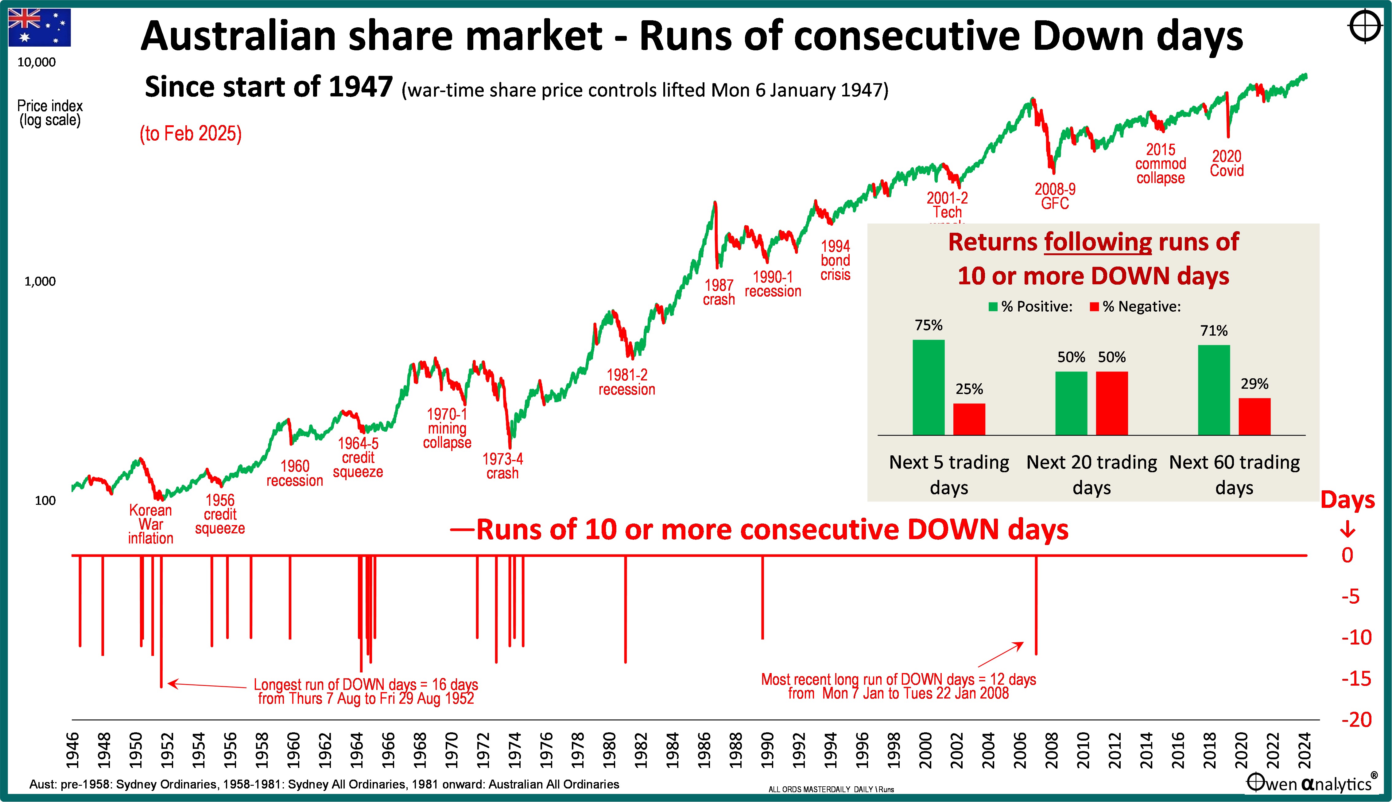
The longest run of down days was 16 days straight from Thursday 7 Aug to Fri 29 Aug 1952, during the Korean War inflation spike sell-off. Inflation shot up to 19% due to the delayed lifting of war-time price controls, and also the Korean War wool boom.
The most recent run of 10 or more down days was 12 days from 7th to 22nd January 2008, in the midst of the collapse of some US credit derivatives funds, rising US unemployment and margin calls, in the early stages of the 2008-9 global financial crisis.
Before the period covered by this chart, there was also a 15 day down run in September 1930, in the middle of the 1929-31 crash, and a 12 day down run in 1941 during German and Japanese advances just before Pearl Harbour.
Calmer in recent decades
Six of these 10 or more day down runs occurred in the 1964-5 credit squeeze sell-off, and five occurred in the deep 1973-4 property/finance crash.
We can see from this chart that long runs of down days were much more common in the 1950s, 1960s, and 1970s. The market has been much smoother in recent decades. This is true with whatever number of down days we set as the threshold.
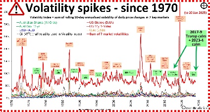
For other measures of volatility over time – see: Bring on the Trump ‘volatility’! – My Volatility Spike index separates the calm from the storm (21 Jan 2025)
What happened next?
Essentially, after these down runs, the market resumed its more or less random behaviour.
The insert chart in the main chart above shows what happened in the next 5 trading days, 20 trading days, and 60 trading days immediately following these runs of 10 or more down days.
In the 5 days immediately following these down runs, the market rose 75% of the time and fell 25% of the time. It was similar for the 60 days following the down runs, and the market was up 50% of the time in the next 20 days.
Given the small sample size here, these outcomes are pretty much random – ie the market resumed its more or less random behaviour following these down runs.
Here are the market moves in the 5 days, 20 days, and 60 days following the down runs in the main chart.
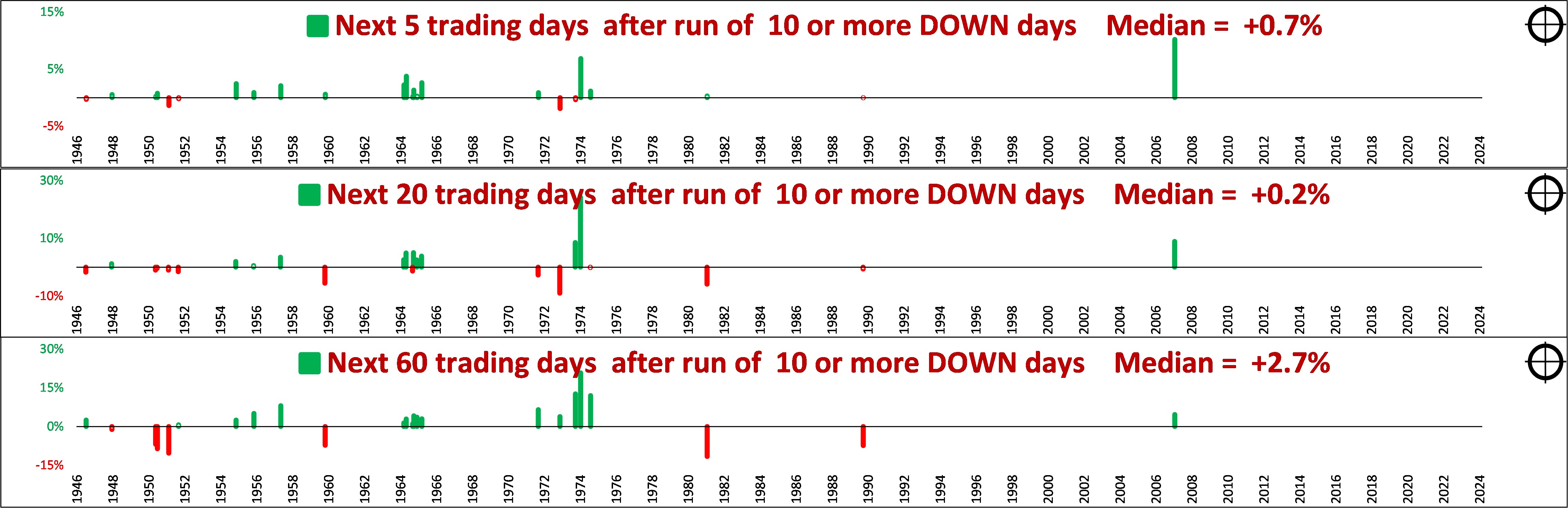
These reveal no consistent pattern. Some were followed by strong rebounds, and others were followed by further sell-offs, with different circumstances in each case.
Do long down runs point to market corrections?
The evidence is mixed:
-
-
- Some of the long runs were in the early stages of a broader crash (eg. January 2008, September 1990, November 1955, September 1972).
- Others were in the middle of a correction (eg. September 1930, October 1960, January 1982),
- and others were toward the end (eg. December 1948, ).
The common element is the fact that nearly all of these long down runs were part of a major market sell-off.
The only exceptions were the 11-day down run in July 1947 (Chifley Labor government tried to nationalise the commercial banks, well before the 1948-9 sell-off), and the 10-day down run in May 1958 (losses and dividend cuts from the barrier miners, plus lower wool sales, in the middle of the 1950s long boom.)
Is the market ‘random’ or does it have a ‘memory’?
Long down runs occur more frequently than they statistically should if the market was purely random.
8-day runs are 50% more frequent than random. 10-day down runs are twice as frequent than random. 12-day runs are three times more frequent than random, and it departs further from random behaviour the longer the runs last.
Because of this departure from random behaviour during times of sustained negative sentiment, after X down days in a row, the chances of the next day also being down becomes more than just a random coin toss.
In periods of sustained stress and negative sentiment, the market ceases to be a more or less random coin-toss, and starts to develop a ‘memory’ – ie momentum. Negative sentiment tends to feed on itself until some event breaks the cycle.
In the past, long down runs have usually occurred in periods of sustained negative sentiment – mostly (but not always) as part of a major market sell-off.
Where are we now?
This particular down run is probably evidence of gathering stress. It does not necessarily point to a major correction, but it probably does support plenty of other evidence that suggests a correction is due.
(For math aficionados – the default market model is ‘random with a drift’ – because the market generally marches up over time due to inflation, rising earnings, etc. The average drift is around +0.0225% per day, so the coin-toss is not strictly 50/50, it is a biased 52/48 coin-toss).
I thank you for your time, and hope this provides some food for thought on your investing journey. I certainly learned a lot doing the exercise.
‘Till next time . . . safe investing!
For my most recent monthly report on Australian and global markets -
For more on the Australian share market -
For more on the current US tech boom -see:
For other measures of volatility over time – see: