Key points:
-
- Share market returns vary greatly in different inflation conditions.
- Returns are consistently lower (and below average) when inflation is rising, and returns are consistently higher (and above average) when inflation is falling.
- This applies to ‘nominal’ returns, and even more so to ‘real’ (inflation-adjusted) returns, where rising inflation is especially damaging to real returns, which is critical for retirement planning.
- The favourable share market returns we have enjoyed over the past 20-30 years were largely driven by declining inflation and interest rates. If that phase is over, what does the next phase look like?
Two of the biggest risks faced by long term investors (including those planning for, and in, retirement) are inflation risk and market risk (eg share markets). Here I define ‘risk’ as the chance of things turning out less favourably than what was planned or expected. Especially for retirees because by the time they see things going off the rails, it is often too late for them to do much about it.
The financial advice and retirement fund industries in general do a very poor job of informing and preparing investors for these risks.
Simplistic assumptions
Inflation and market risk are related of course. Two of the main determinants of future share market returns are pricing/valuation levels and inflation, both of which can vary greatly, with significant impacts on returns. But retirement calculators provided by government (eg moneysmart), consumer organisations (eg, Super Consumers Australia), industry associations (eg ASFA), Super funds (eg AMP, AusSuper), and financial planning firms ignore this and instead use nice, neat, constant, stable assumptions in their projections.
(Some forecast models use fancy sounding terms like ‘stochastic probabilities, ‘Gaussian distributions’, ‘monte-carlo simulations’, and ‘Wigner functions’. These sound very impressive but they are nonsense (trust me - I used to teach this stuff!), because they assume that returns are random and normally distributed, which they are demonstrably not. Never have been, never will be, because markets are run by wild human emotions, not calm, rational logic.)
For inflation, most retirement forecast models assume a stable, constant number like 2.5% pa (middle of the RBA’s range). For Australian shares, most assume a stable, constant round number like 10% pa (because that’s what the market has generated for the past century). For a diversified fund with say 60-80% shares, most assume stable, constant returns at a nice round number like 8% (based on a mix of Australian and global shares), or they assume a repeat of historical returns over the past 10 or 15 years.
Projections and plans based on simplistic forecasts create unrealistic expectations for investors. When markets don’t behave as expected (which is inevitable), investors start to worry, and to question “Am I still on track?”, which can lead to switching or abandoning their strategies.
Inflation and share market returns
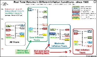
Inflation is one of the most critical risks for long term investors, not just because inflation erodes purchasing power, but also because returns from all types of investment assets vary considerably in different inflationary conditions. Here we look at the impact of inflation cycles on returns from the Australian share market.
The first chart shows the impact of inflation on nominal total returns from the broad Australian share market since 1900. This is a long enough period to observe a wide range of market conditions and inflation cycles.
‘Total returns’ means price returns plus dividends reinvested. The ‘nominal’ return is the actual return you see on your statement, and is reported in the media. We deal with ‘real’ (inflation-adjusted returns) later. (For this exercise, returns are based on broad benchmark indexes before fees and taxes).
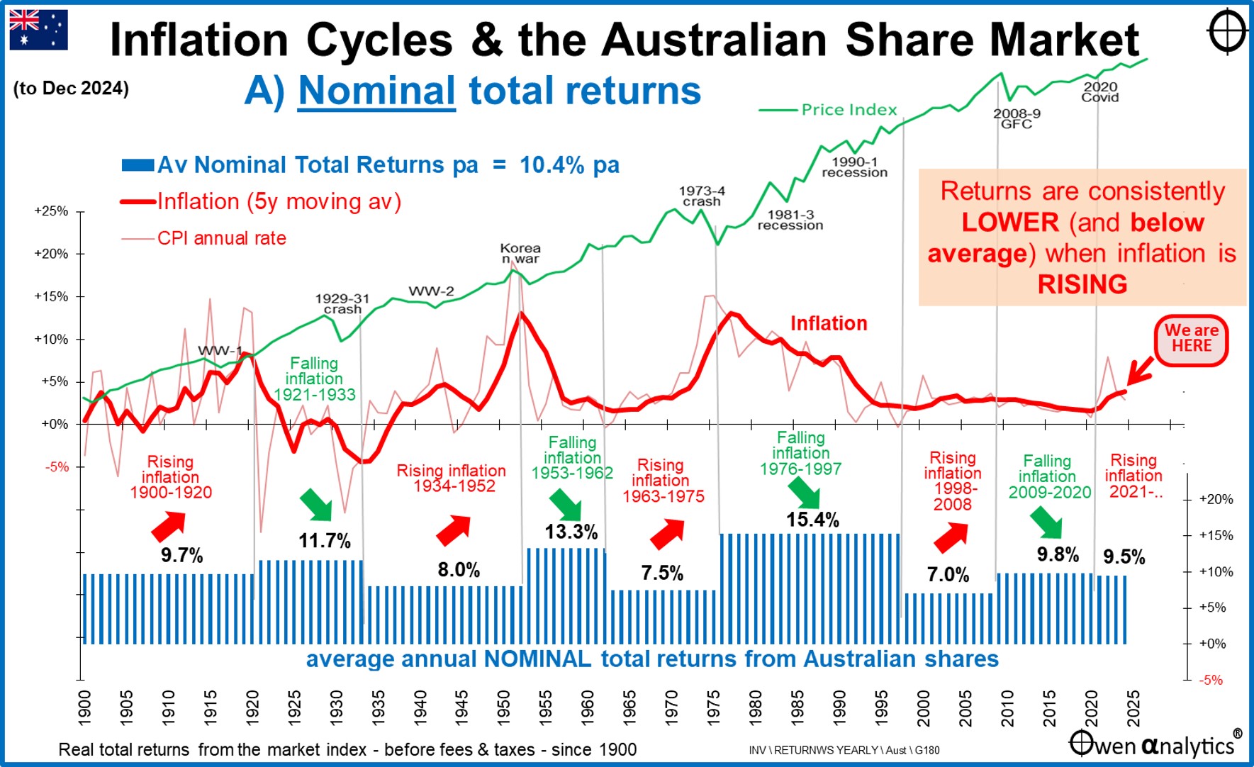
The green line in the upper section is the market price index (All Ordinaries and predecessors), broken into the different inflation phases.
Inflation cycles
The red lines in the middle section show the Australian inflation experience since 1900. The fine red line is the annual CPI inflation rate, and heavy red line is the five-year moving average, which smooths out short-term volatility in the annual rate.
There have been three main periods of rising inflation: -
-
- 1900-1920 culminating in the post-WW1 spike,
- 1934-1952 culminating in the post-WW2/Korean War inflation spike,
- 1963-1975 culminating in the Whitlam crisis.
- There was also a minor period of rising inflation from 1998 (after inflation was briefly negative in 1997) through to 2008 at the top of the China-led commodities boom.
To the far right we can see the recent mini-resurgence of inflation. This recent rise in inflation (and interest rates) may have seemed scary and unusual for young people who have only ever experienced the post-1990s low-inflation era, but for the rest of us it was rather mild compared to what we lived through in the 1970s and 1980s.
Nominal returns are consistently lower with rising inflation
Over the whole period since 1900, the broad Australian share market has generated nominal total returns averaging above 10% per year, but returns have been very different in different inflationary conditions.
The blue bars in the lower section show average annual nominal total returns during each phase of rising inflation and falling inflation. There are individual good years and bad years in every phase of course, but these blue blocks are the average returns per inflation phase.
When I first created this chart nearly two decades ago, I was surprised to see how consistent this pattern is. The shape of those blue blocks will stick in my mind forever, as it should for all long term investors. (We also see this shape repeated for real returns below.)
Average returns during the ‘rising inflation’ phases have been consistently lower than returns during ‘falling inflation’ phases. Even in the mild rising inflation phase from 1998-2008, returns averaged just 7% pa, compared to 15% in the preceding 1976-1997 falling inflation phase.
The poor returns in the 1998-2008 rising inflation phase were of course caused mainly by share market collapse in the GFC. But the GFC was not some random, unrelated event. Inflation was one of the major indirect factors. First, rates were kept too low for too long in the early-mid-2000s (mainly in the US), which contributed to the explosive credit boom (and credit derivatives boom) which was the underlying cause of the GFC. Second, the seventeen Fed rate hikes in 2004-6 to kill inflation ended the credit boom and set the scene for the credit derivatives market to unravel in 2007-8.
Likewise, the poor average returns for the 1963-75 rising inflation phase were mainly due to the 1973-4 crash. Although it was primarily a property/finance crash, the main contributing factors were the rate hikes and credit squeeze to fight inflation.
Likewise, with the poor returns for the 1934-1952 rising inflation phase were mainly due to the 1951-2 share market sell-off, where the main trigger was fiscal tightening measures to fight the Korean War inflation spike, and so on.
The point is that inflation and share market returns are not unrelated, as assumed in simplistic projections used universally in the financial advice and retirement fund industries.
Nominal returns not too bad?
At first glance, the lower average returns in the rising inflation phases still appear to be not too bad. Returns averaged 9.7% pa in the 1900-1920 rising inflation phase, 8.0% pa in the 1934-1952 rising inflation phase, 7.5% pa in the 1963-1975 rising inflation phase, and 7.8% pa in the 1998-2008 rising phase.
Those are still pretty good returns, aren’t they?
The problem is that those are the nominal returns before inflation. Nominal returns may look good on a portfolio statement but ‘you can’t eat them’. You can only buy things in the future with the ‘real’ returns after inflation.
‘Real’ (inflation-adjusted) returns much lower with rising inflation
As long-term investors we focus more on the real returns after the wealth-destroying effects inflation, especially as inflation has a compounding destructive effect on wealth over time. (It is the downside of Einstein’s ‘magic of compounding interest’ effect).
The next chart below is the same as the first except the maroon bars in the lower section are the average annual real total returns during the same inflation cycles.
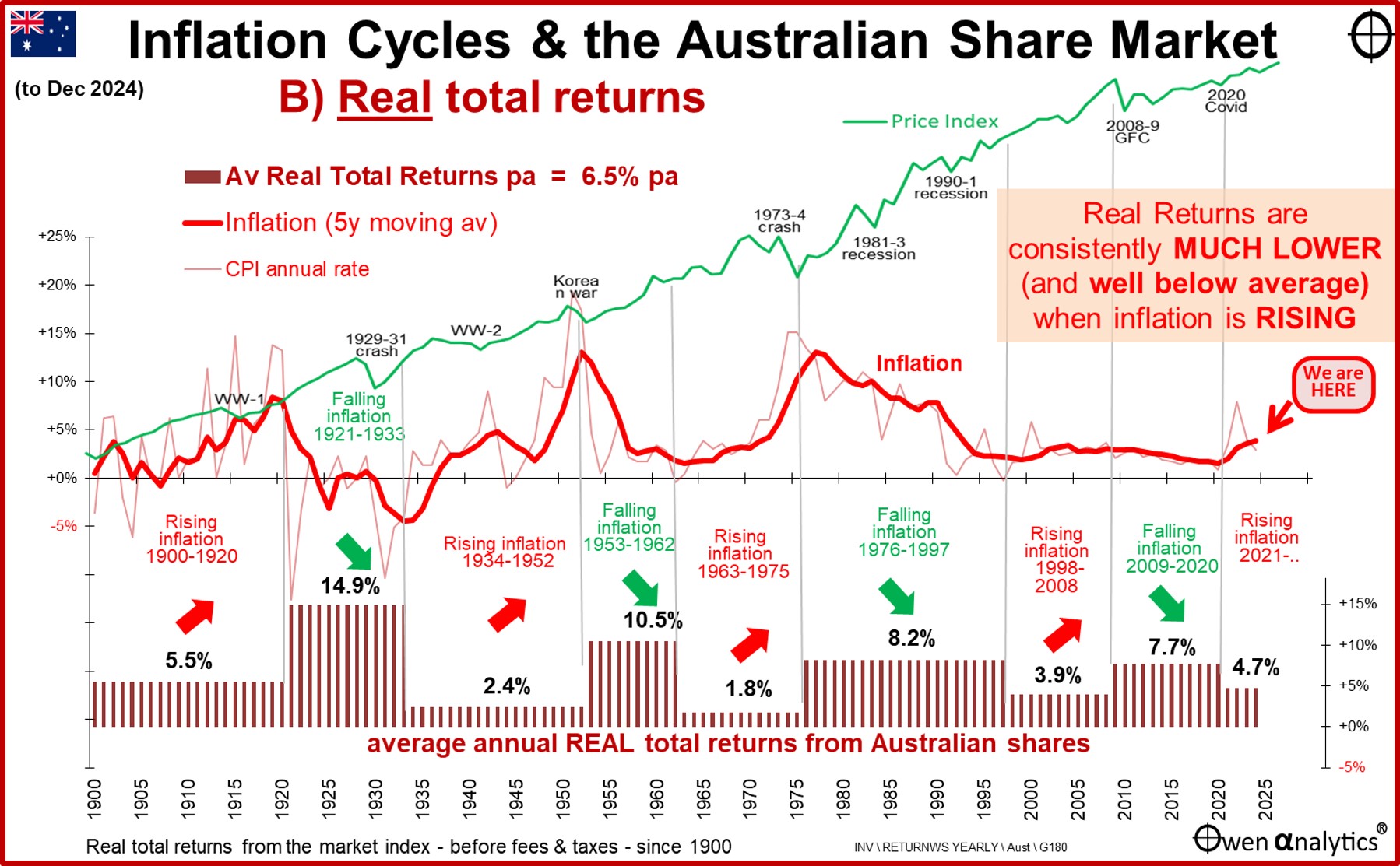
Here we have the same up and down box pattern as with nominal returns chart, but with real returns the differences are more pronounced. Real (ie inflation-adjusted) returns have consistently been MUCH lower (and WELL below average) in periods of rising inflation.
There have been some very long periods of rising inflation when real returns from the share market have been barely above zero. For example the 20 years from 1900 to 1920, 18 years from 1934 to 1954, 12 years from 1963 to 1975, etc. These are not just a few bad years – the market has experienced periods of up to a couple of decades at a time of very poor real returns when inflation is rising.
Inflation makes a big difference – especially for Real returns
In nominal terms - returns averaged 12.7% pa in falling inflation periods, but just 8.3% pa in rising inflation periods. This return difference of 4.4% pa is statistically significant (p=0.001940, confidence level = 99.8%).
In real terms, the return difference is even greater. Real returns averaged 9.8% above inflation in falling inflation periods, but a very low 3.7% above inflation in rising inflation periods. This difference of 6.2% pa is also statistically significant (p=0.000084, confidence level = 99.9%).
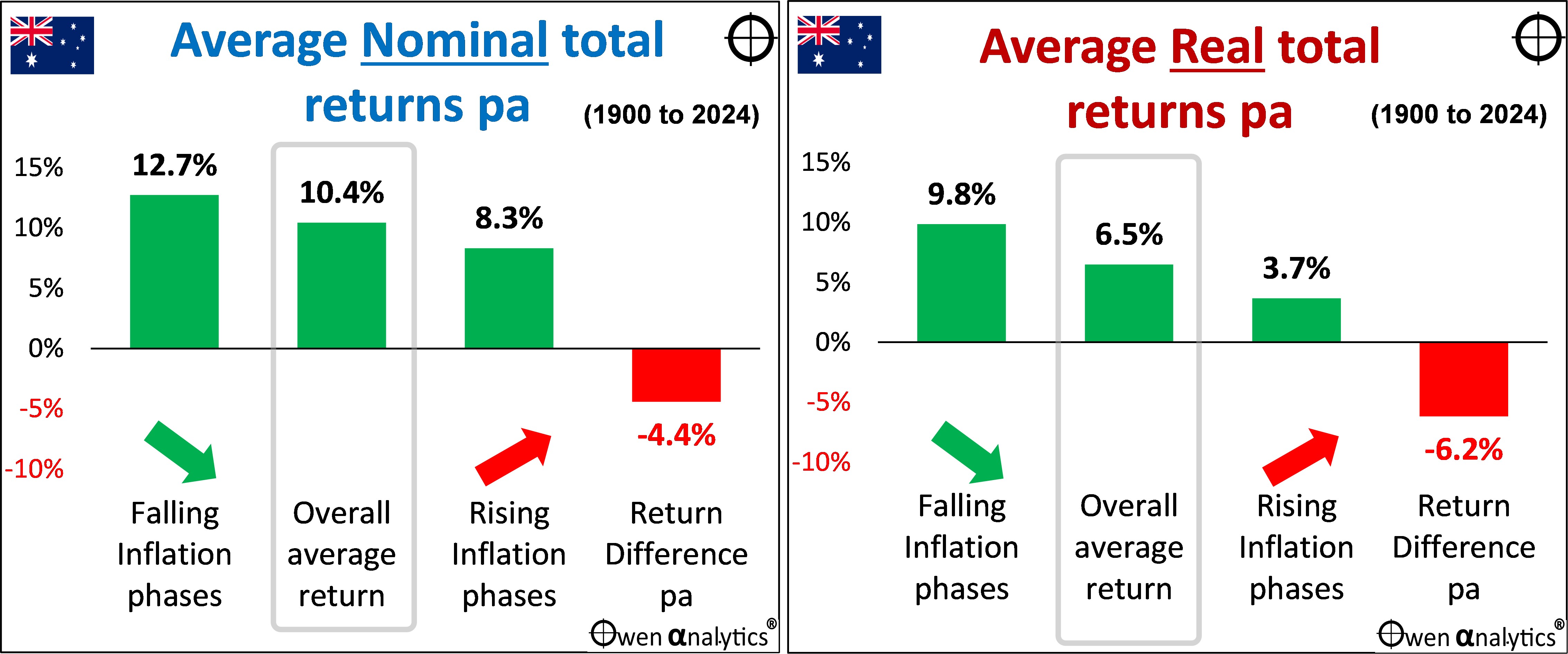
The negative correlation between real share market returns and inflation is more pronounced in rising inflation phases.
Implications for investors, their advisers and portfolio managers
For long-term investors with a real return target like ‘CPI+4%’ (which is common in large Super funds and pension funds globally), this presents a real problem. A CPI+4% strategy works in textbooks, but in can fail for up to a couple of decades at a time the real world if you happen to be in a rising inflation phase.
(This story relates to Australian shares only. Diversified portfolios would have other assets, including ‘defensive’ assets that reduce portfolio returns and make the CPI+4% target more difficult.)
Share market returns and inflation are not unrelated factors you can project independently. You can’t forecast a real return number for the share market, then tack it on to an inflation forecast number. They are intertwined in the real world, and must be assessed together.
Returns vary widely depending different sets of conditions, like inflation cycles that can last for long periods, so we cannot simply extrapolate past returns into the future. Although legal disclaimers require advisers and product providers to proclaim: ‘Past performance is not necessarily a guide to future performance’ (ASIC RG 168.150), everybody does it because that’s all they have to cling to!
How to forecast the unknowable future?
All forward planning involves forecasting the future. But if the future is unknowable, how can we forecast? Conditions change, and the returns generated by those conditions also change.
Rather than ask: ‘Are the returns of the past likely to continue into the future?’, it is usually more instructive to ask: ‘Are the conditions that gave rise to the returns of the past likely to continue into the future?’
What we can say is that the conditions that supported relatively good share market returns over the past 20-30 years included declining inflation, and with it, declining interest rates and discount rates.
The problem is that many of the conditions and policies that drove the great decline in inflation and interest rates in Australia and around the world (and fuelled share markets) have stalled and/or reversed. For example:
-
-
- Globalisation, tariff reductions, and free trade ideology are being replaced by rising protectionism, ‘made at home’, subsidised self-sufficiency, and ‘friend-shoring’,
-
-
- ‘Just-in-time’ supply chains are being replaced by ‘just-in-case’ – increasing costs and requiring more capital,
-
-
- Hands-off, laissez-faire, economic rationalist governments are being replaced by hands-on, interventionist, centrally controlled governments,
-
-
- Steadily increasing size of the non-market-based government sector in almost every country, relative to the market-driven private sector,
-
-
- Deregulation and unfettered flexibility (eg financial and labour markets) are being replaced by re-regulation and decreased flexibility,
-
-
- Productivity growth that was high in the reform-driven 1980s and 1990s has been replaced by stalled productivity growth, with not even a hint of productivity growth in wage negotiations,
-
-
- Central banks that gained ‘independence’ in the 1990s are losing, or have lost, much of their independence in many countries and are now just another arm of government politically-driven agendas,
-
-
- Tax cuts that drove profits and spending in recent decades cannot continue at the same pace, and taxes may need to rise to pay for big government deficits and debts, including populist taxes on the rich,
-
-
- Pluralist, tolerant democracies are becoming more populist, extremist, xenophobic, nationalist,
-
-
- Reform-driven government policies of the 1980s and 1990s have been replaced by populist, short-term vote-buying policies,
-
-
- Tolerance to immigration to increase demand and suppress wage growth, is being replaced by populist, xenophobic/racist backlashes against immigration, resulting in tight labour markets and wage pressures,
-
-
- Favourable demographics with abundant labour forces in the 1980s and 1990s following the post-WW2 baby boom have turned into aging populations where workers are a smaller proportion of the population, giving them more wage bargaining power, leading to higher wages with no productivity trade-offs,
-
-
- The ‘peace dividend’ with declining military spending with thawing of the NATO-Soviet cold war, has been replaced by new global cold war, and escalating military build-ups everywhere. (Throughout history, military build-ups and wartime spending have been the main causes of general price inflation).
-
-
- The tech sector’s low demand for savings/capital is being overtaken by highly capital-intensive, government- sponsored renewable energy infrastructure and social infrastructure spending, where increased demand for savings/capital increases interest rates.
-
-
- Higher capital requirements for banks, increasing demand for savings/capital.
On the other hand, a.i. evangelists talk about a future world in which a.i. reduces the cost of all goods and services to near zero. If it does, it would result in massive price deflation, and either dramatic cuts to wages and/or mass unemployment.
Whichever scenario turns out to be true, we can guarantee two things – inflation over the next couple of decades will not be a nice, neat, stable, constant 2.5% pa, and ASX returns will not be a nice, neat, stable, constant 10% pa nominal or 6.5% real.
Hopefully this has provided another useful perspective in forward planning.
‘Till next time. . . . safe investing!
For inflation impacts on other asset classes -
For a long-term perspective on asset class returns -
For my latest monthly market snapshot -