Key points:
-
-
- Here’s an update on share market pricing around the world, based on the two most widely used measures - price/earnings ratios and dividend yields.
- USA and India are way out in 'expensive' territory. Are these justified?
- Australia appears less expensive – but still over-priced given its market structure and sector mix.
- At the 'cheap' end are Italy, Brazil, Hong Kong, and Saudi Arabia – does ‘cheap’ mean ‘good value’?
- Is global share market over-pricing a problem? Is a crash imminent?
- Why have I remained reasonably bullish on global/US shares despite increasingly expensive pricing?
Share Market Pricing per country
Here’s my updated quick snapshot of share market pricing around the world (data to end of July 2025).
The chart plots share market pricing for the 20 largest share markets in the world (which together account for more than 95% of total global share market value) based on two of the most widely used measures of pricing – ‘price/earnings ratios’, and ‘dividend yields’.
The size of the symbol for each country represents the relative size (market value) of each country’s share market.
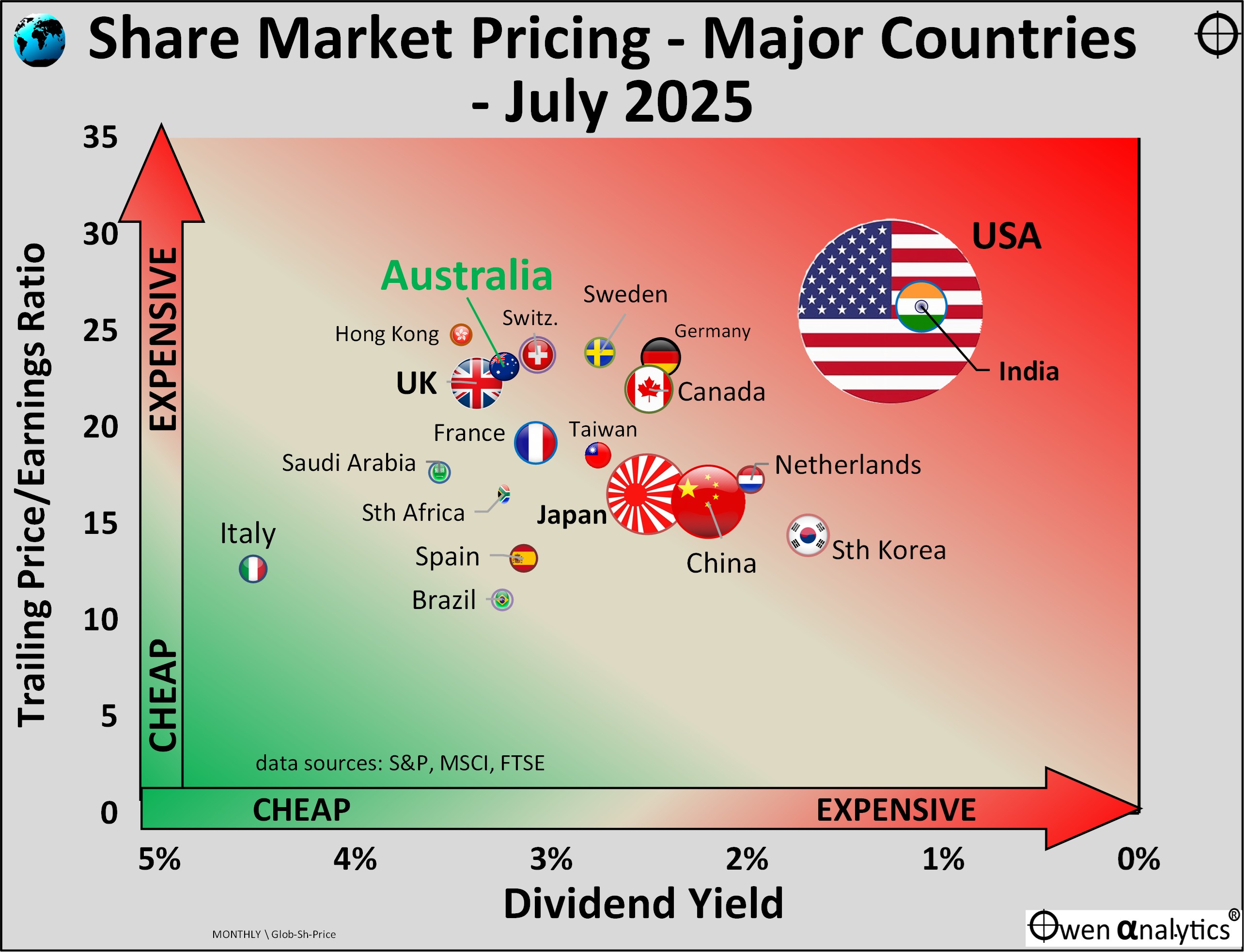
Price/earnings ratio
The ‘price/earnings ratio’ (or ‘p/e’) for a given market is the total market value of shares of companies in the broad market index divided by the aggregate reported profits for the most recent 12 month period from those companies. It is essentially the current market price investors are paying per dollar (or pound or euro or yen, etc) of profits generated by the market.
(NB. The term ‘earnings’ and ‘profits’ are interchangeable in this context. ‘Earnings’ means reported after-tax profits from the company, or aggregated across an entire sector, country, region, etc.)
Price/earnings ratios are plotted on the vertical (y) axis – the more expensive (higher p/e ratio), the further up the chart it appears.
Dividend yield
This is the aggregate cash dividend declared by index companies over the most recent 12 months, divided by the total value of companies in the index. It is the cash yield per dollar of current value.
Dividend yields are plotted on the horizontal (x) axis – but note here that I start with low pricing (high dividend yields) at the left, and higher pricing (low dividend yields) to the right. Cheap (green) is bottom left. Expensive (red) is upper right.
US market dominates
The US stands out for its sheer size, at 58% of the total market value of ‘investable’ companies listed on world share markets. US listed companies account for US$61trillion market value out of the world total of US$103 trillion. However, note that the US accounts for just one fifth of listed companies by number, out of the total of 15,000 companies listed on world stock markets.
Most expensive share markets: USA and India
The upper-right sector of the chart is the most expensive – with the highest pricing per dollar of profits (highest price/earnings ratios), as well as highest pricing per dollar of dividends (ie lowest dividend yields).
The US market is the main reason for the current expensive level of pricing of the overall global share market.
Note that for this exercise I use the S&P1500 Composite index (largest 1,500 US companies) as it offers a more comprehensive picture of the overall US share market than the much narrower but better known S&P500 index which is just the largest 500 companies. At the end of July 2025, the trailing P/E ratio for the narrow S&P500 index was actually a significantly higher (more expensive) 29.3, compared to 26.0 for the broader S&P1500 index.
Without the US, the ex-US global share market would be much more reasonably priced, at 19 time earnings and a dividend of 2.5%. ‘Ex-US’ world share market pricing would be between Japan and Canada on the chart. Still expensive on both measures but not as high as the US.
The US and India are by far the most expensive on both measures. Both markets are trading on significantly higher pricing (higher P/E ratios and lower dividend yields) than their historical averages. (More on India below.)
The US market is expensive overall mainly because of a small handful of tech companies, dubbed the ‘Magnificent Seven’. For an in-depth analysis of the pricing ‘lumpiness’ of US companies, see -
‘Expensive’ does not necessarily mean ‘poor value’ or ‘sell’
There are plenty of investors who have done very well from US tech stocks in recent years – including anyone with a global share index fund/ETF. (I personally have been over-weight the big US tech stocks in portfolios, despite their very high pricing).
There are also plenty of wealthy and smart investors who are more than happy to hold, and buy more, of stocks like Nvidia at 58 times earnings, or Microsoft at 38, Apple at 33, Amazon at 34, Meta/Facebook at 28.
Brave to buy more at those levels but, hey, you only make big money by taking risks! As long as you don’t borrow to invest, and you are doing it with spare money you or your family won’t be relying on in future and won’t miss if you lose it (my definition of ‘play money’) then why not?
The cheap seats
The lower-left sector is the least expensive – with low pricing per dollar of profits (low price/earnings ratio), as well as low pricing per dollar of dividends (ie high dividend yield).
At the ‘cheap’ end of the spectrum are Italy, Brazil, Hong Kong, and Saudi Arabia. They are cheap for a variety of reasons. Italy - dominated by banks and fossil fuels, Brazil - dominated by banks, iron ore (Vale) and oil/vas (Petrobras), Saudi Arabia - oil (Aramco) and mostly banks, Hong Kong – mainly financials & real estate, and Hong Kong is rapidly losing its role as a global financial centre with China’s increasingly heavy handed interference.
Does relatively low pricing make these relatively cheap markets ‘good value’ or ‘good buying’? Not necessarily.
Australia – how do we rate?
Relative to other countries, Australia appears less over-priced than most. However, its price/earnings ratio of 23 times profits is very high (expensive) relative to its historical average P/E ratio of 12.5 since 1945, and 15.8 since 1980. Australia’s current P/E ratio is in the 97% percentile rank of historical P/Es – ie it has only been more expensive 3% of the time.
On dividend yields - the ASX’s current dividend yield of 3.2% is relatively high (cheap) compared to other countries, but it is very low (expensive) relative to its own historical median dividend yield of 4.2% since 1945, 4.1% since 1980, and 4.0% since franking was introduced in 1987. The current dividend yield of 3.2% is in the lowest 6% percentile rank of historical dividend yields – it has been higher 94% of the time.
Franking Credits?
True, we can add a further 1.1% return from franking credits this year (for zero tax bracket Australian investors), but even with franking credits, the current ‘grossed-up’ dividend yield is near record lows for the Australian share market. (Note also that the 1.1% return from franking for the 2024-5 financial year was the fourth lowest in 38 years of franking).
The bottom line is that what appears to be relatively cheap pricing for the Australian market relative to other countries, is actually still very expensive relative to our market’s historical performance and structure, especially since out market is dominated by two sectors that ordinarily should trade at relatively low P/E ratios and relatively high dividend yields – banks and miners.
For more on pricing of the Australian share market, see:
Countries relative to each other, not relative to their historical averages
It is important to note that this chart is purely a comparison of countries relative to each other.
This country-against-country comparison is a handy way of seeing relative pricing in a global context, but it ignores differences in structural conditions within each market (eg tax, regulatory, political, interest rates, etc).
For example, the Indian share market has always paid very low dividend yields relative to most other countries, due to its relatively low pay-out ratios (high retention rates), as Indian companies have always been financed mainly by domestically sources, especially via retained earnings. India’s lack of reliance on foreign capital has been a strength at times (during crises like the 1997 Asian crisis and 2008-9 GFC), but also a weakness as it has hampered growth.
At the other extreme, the Australian share market has always paid high dividend yields relative to most other countries, due to relatively high pay-out ratios, as Australian companies on the whole have been financed largely by external capital (secondary raisings), and foreign capital, rather than retained earnings.
For more on Australia’s relatively high dividend yields, see -
Where are we now on global share market pricing?
There is no doubt the US tech boom is unsustainable and cannot keep inflating more quickly than profits and dividends forever. There will be a reckoning sooner or later.
However, it is important to remember that over-priced booms do not end because or when they become over-priced. Over-priced booms can run on into even more over-priced territory for several years until finally collapsing.
Booms turn to busts because of a trigger or series of triggers that prick the over-confidence bubble and turns into over-pessimism and panic selling. We have had some potentially fatal triggers in recent years – the 2020 Covid lockdown recessions, the 2022 aggressive rate hikes to tackle inflation, the 2025 Trump ‘Liberation Day’ tariff scare. These have triggered sharp but temporary corrections, but we have not had the BIG ONE yet.
The crash will come one day, but the final trigger is out there somewhere! High market pricing increases vulnerability to the final trigger when it does arrive.
Meanwhile, the base case remains – the Trump TACO Trade, consumer confidence and spending holding up reasonably well, foreigners continuing to be willing to buy US treasuries to finance the US deficit spending spree, and tax cuts for companies and the rich, which boosts confidence even if there is no ‘trickle-down’ effect.
Deeper dive required
Because today’s chart is based on two very rudimentary metrics – price/earnings ratios and dividend yields – it glosses over a host of details about underlying causes and conditions in each market that we would need to assess before making investment decisions.
Therefore, over the next two weeks I will publish a deeper dive into some of the approaches I use when assessing share market pricing – in 5 parts:
-
-
- Part 1: P/E ratios, Dividend Yields, Price-to-Book value
- Part 2: Forward P/E ratios and Earnings growth assumptions
- Part 3: Profit Margins & Returns on Equity
- Part 4: Growth rates for Profits & Dividends
- Part 5: PEG ratios – what price growth?
‘Till next time . . . . safe investing!
Data for today’s chart:
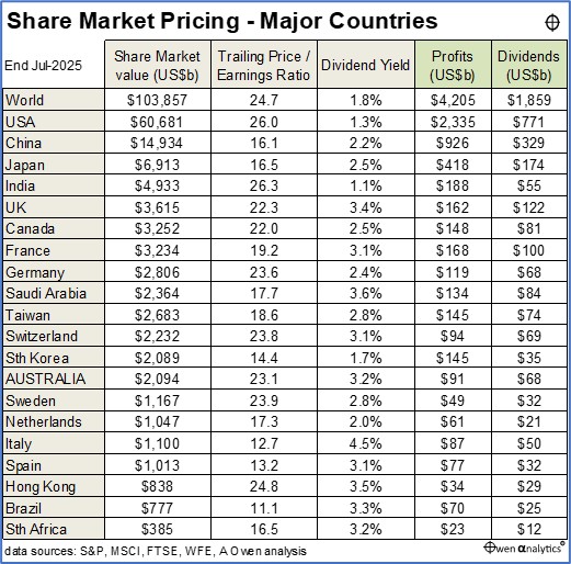
(Note that the market values of all countries total to more than the overall world share market value because not all of the domestic share markets in China and India are generally considered investable globally.)