Key points:
The impact of US inflation cycles on the US share market has been the same as the impact of Australian inflation cycles on the Australian share market I outlined in my last story.
- Returns are consistently lower (and below average) when inflation is rising, and consistently higher (and above average) when inflation is falling.
- This applies to ‘nominal’ returns, and even more so to ‘real’ (inflation-adjusted) returns, where rising inflation is especially damaging to real returns.
- The favourable share market returns we have enjoyed over the past 20-30 years were largely driven by declining inflation and interest rates. That phase is over.
Last week I posted a story about the impact of inflation cycles on returns from the Australian share market.
Several people have asked if this pattern is unique to Australia, or does it apply to the US and other markets. Today’s story is the same exercise on the US share market, and the results are the same.
Not only has the impact of US inflation cycles on the US market been virtually the same as the impact of Australian inflation cycles on the Australian market, but Australia and the US have experienced the same inflation cycles and the same share market cycles, with only minor differences in timing and relative severity of each cycle.
In today’s story I show the US version of the same charts I did for last week’s story on the Australian market. As you will see below, the Australian and US charts show the same patterns. For each US-Australian pair of charts, it is hard to tell them apart. (I put country flags in the corner to help me remember).
Refer to the story on the Australian cycles for a fuller explanation of the idea and the implications.
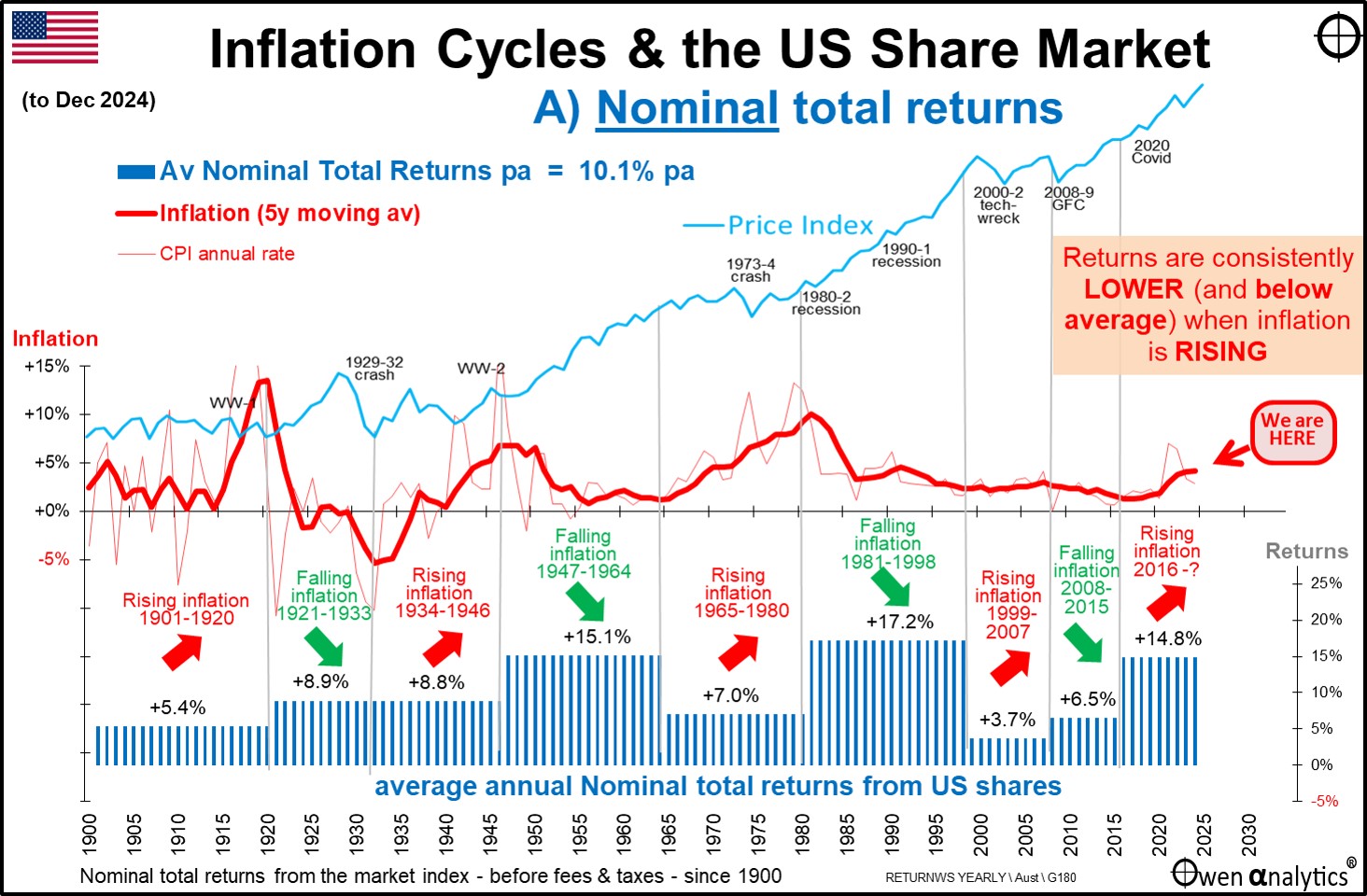
Inflation cycles and Nominal total returns from share market
First – here is the US chart showing average nominal total returns from the US share market during each US inflation phase – ie rising and falling inflation (disinflation).
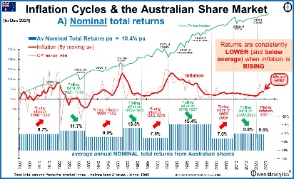
Here is the equivalent chart for Australia (from the last story):
The US pattern has been similar to the Australian pattern (blue boxes in the lower section of each chart) – ie higher average nominal total returns from shares when inflation is falling, and lower average nominal returns when inflation is rising. Even in the relatively minor rising inflation phase from 1999-2007, returns averaged just 4% pa (7% in Australia), compared to 17% pa (15% in Australia) in the preceding falling inflation phase.
The broad pattern is the same, with minor differences.
Inflation cycles similar
US inflation cycles are very similar to Australian cycles of course because these are global cycles. But there have been some differences in timing and depth of some inflation cycles due to local policies.
For example, the post-WW2 inflation spike ended in 1946 in the US but extended to 1952 in Australia because of two local factors: 1) In Australia, Chifley delayed lifting post-war price controls and rations much longer than Truman in the US (Ben Chifley tried to retain war-time controls forever as the basis for a socialist state where the government controlled and/or owned everything. Voters rejected this and tossed Labor out in the 1949 election); and 2) Australia had a massive inflation spike from the wool boom in the Korean War.
Likewise, differences in local policies resulted in the 1970s inflation spike peaking with Whitlam in 1975 in Australia, but in the US didn’t reach a peak until Carter in 1979-1980 after the Iranian crisis.
Share market cycles similar
Share market cycles are also similar in Australia and the US because they are also global cycles. As with inflation, there have been differences in timing and depth of share market cycles due to local policies.
For example, Australia’s 1929-31 crash was a year shorter than the US 1929-32 crash because Australia devalued its currency more quickly and more effectively than the US, and Australia defaulted on its foreign debt. The US market’s longer and deeper crash explains the only break in the up-down pattern for nominal returns for the US market (although the up-down box pattern still works for real returns – below).
The only exception to this up-down box pattern for the US market is the 1921-1933 period of falling inflation, where returns were not higher than the 1932-1946 period of rising inflation. This is because the 1929-32 crash was significantly deeper (and a year longer) than the 1929-31 crash in Australia
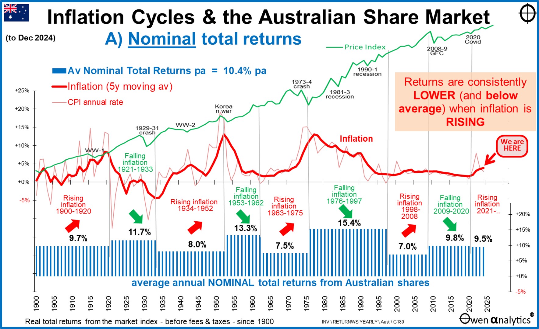
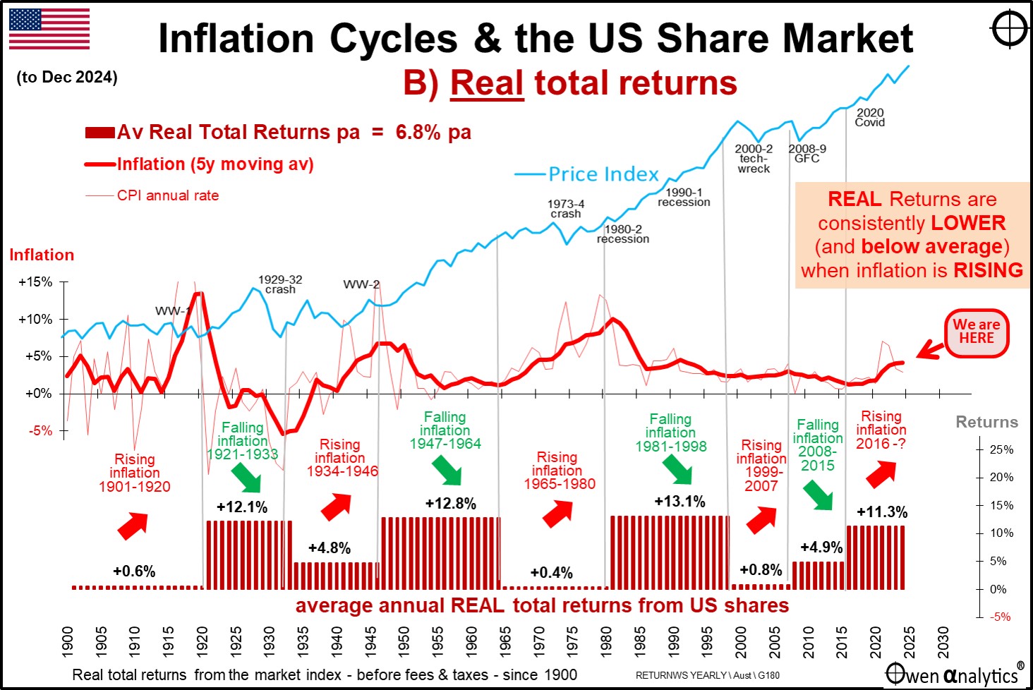
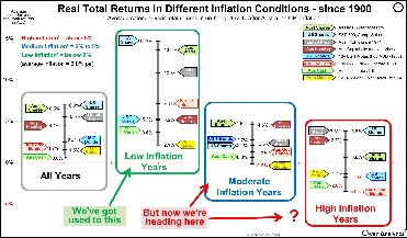
‘Real’ (inflation-adjusted) returns much lower with rising inflation
Here is the US chart for average real total returns from shares in the rising and falling inflation cycles:
Here is the Australian chart for comparison:
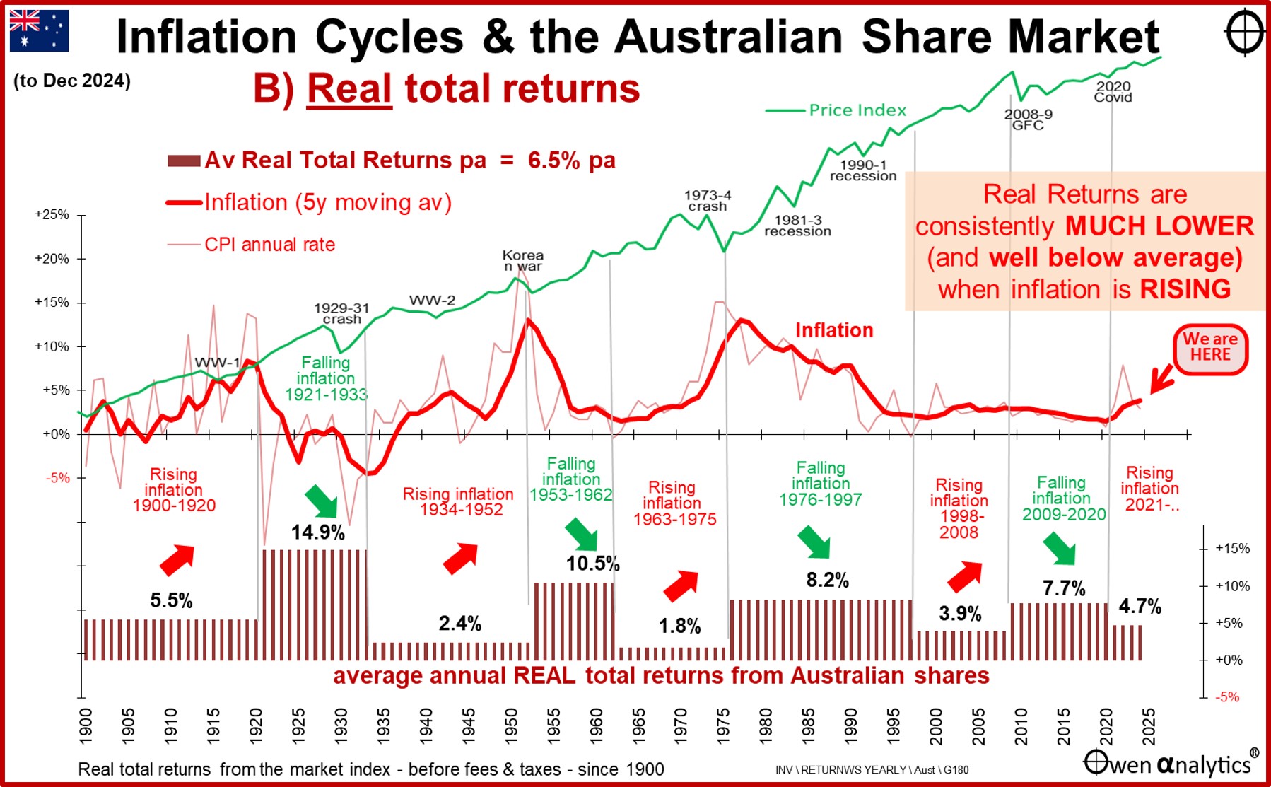
Again, the US pattern for real returns (maroon boxes) has been similar to the Australian pattern, and in both cases, the pattern for real returns are much more pronounced than for nominal returns – ie much higher average real total returns from shares when inflation is falling, and much lower average real returns when inflation is rising. Even in the relatively minor rising inflation phase from 1999-2007, real returns averaged just 1% pa in the US (4% in Australia), compared to 8% pa (13% in Australia) in the preceding falling inflation phase.
Just like in the Australian market, there have been some long periods of rising inflation in the US when real returns from the US share market have been barely above zero. For example, the 19 years from 1901 to 1920, 12 years from 1934 to 1946, 16 years from 1965 to 1980, etc. These are not just a few bad years – the market has experienced periods of up to a couple of decades at a time of very poor real returns when inflation is rising.
Where are we now?
At the far right of the maroon boxes is the current ‘rising inflation’ phase. Returns have been good so far in the current tech/ai boom – but it is early days yet!
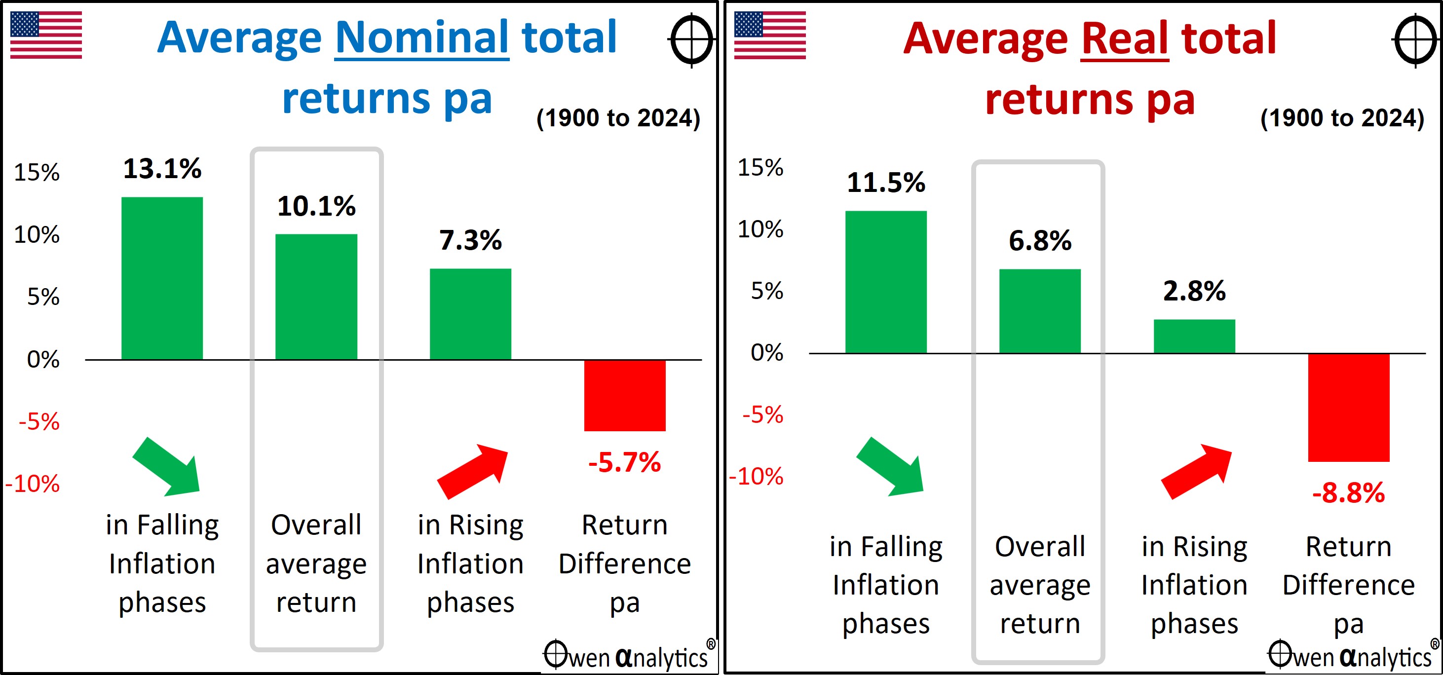
Inflation makes a big difference – especially for Real returns
Lastly, here is the US pair of charts showing differences in returns in periods of rising and falling inflation compared to overall average returns – for nominal returns (left chart) and real returns (right chart):
Here is the equivalent pair of charts for the Australian market for comparison:
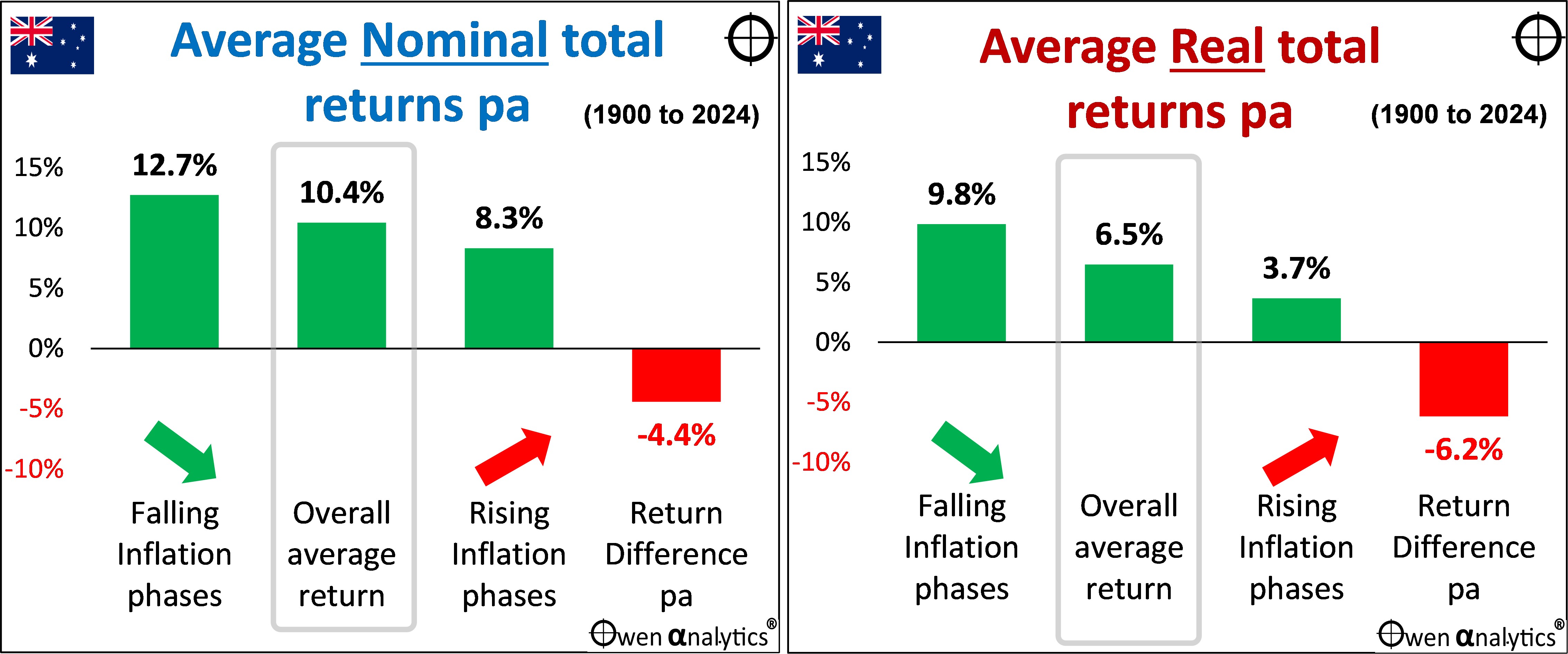
Again the US pattern is the same as in Australia.
In nominal terms – although the US share market returned an average of 10.1% over the whole period, returns averaged 13.1% pa in falling inflation periods, but just 7.3% pa in rising inflation periods. This return difference of -6.7% pa is statistically significant (p=0.000090, confidence level = 99.9%).
In real terms, the return difference is even greater (and even more pronounced than in Australia.
The US market returned an average of 6.8% above inflation over the whole period, but real returns averaged 11.5% above inflation in falling inflation periods, but a very low 2.8% above inflation in rising inflation periods. This difference of -8.8% pa is also statistically significant (p=0.00001, confidence level = 100%).
The negative correlation between real share market returns and inflation is more pronounced in rising inflation phases, and even more so than for the Australian market.
The problem with simplistic ‘average return’ assumptions in planning
(the following sections are the same as in the last story on the Australian market. This is the ‘so what’ section – what all of this means in practical terms for investors.)
Inflation and market risk are related of course. Two of the main determinants of future share market returns are pricing/valuation levels and inflation, both of which can vary greatly, with significant impacts on returns. But retirement calculators provided by government (eg moneysmart), industry associations (eg ASFA), consumer organisations (eg, Super Consumers Australia), Super funds (eg AMP, AusSuper), and financial planning firms ignore this and instead use nice, neat, constant, stable assumptions in their projections.
(Some forecast models use fancy sounding terms like ‘stochastic probabilities, ‘Gaussian distributions,’ ‘monte-carlo simulations,’ and ‘Wigner functions.’ These sound very impressive, but they are nonsense (trust me - I taught this stuff!), because they assume that returns are ‘random’ and ‘normally distributed’, which they are demonstrably not. Never have been, never will be, because markets are run by wild human emotions, not calm, rational logic.)
For inflation, most retirement forecast models assume a stable, constant number for Australia like 2.5% pa (middle of the RBA’s range), and 1-2% (Fed target range). For Australian and US share markets, most assume a stable, constant round number like 10% pa (because that’s what the Australian and US share markets have generated for the past century – illustrated in this story).
For a diversified fund with say 60-80% shares, most assume stable, constant returns at a nice round number like 8% nominal, or 5% real (based on a mix of Australian and global shares), or they assume a repeat of historical returns over the past 10 or 15 years.
Projections and plans based on simplistic forecasts create unrealistic expectations for investors. When markets don’t behave as expected (which is inevitable), investors start to worry, and to question “Am I still on track?,” which can lead to switching or abandoning their strategies.
Implications for investors, their advisers and portfolio managers
For long-term investors with a real return target like ‘CPI+4%’ (which is common in large Super funds and pension funds globally), this presents a real problem. A CPI+4% strategy works in textbooks, but in can fail for up to a couple of decades at a time the real world if you happen to be in a rising inflation phase.
(Diversified portfolios would have other assets, including ‘defensive’ assets that reduce portfolio returns and make the CPI+4% target more difficult.)
Share market returns and inflation are not unrelated factors you can project independently. You can’t forecast a real return number for the share market, then tack it on to an inflation forecast number. They are intertwined in the real world, and must be assessed together.
Returns vary widely depending different sets of conditions, like inflation cycles that can last for long periods, so we cannot simply extrapolate past returns into the future. Although legal disclaimers require advisers and product providers to proclaim: ‘Past performance is not necessarily a guide to future performance’ (ASIC RG 168.150), everybody does it because that’s all they have to cling to!
How to forecast the unknowable future?
All forward planning involves forecasting the future. But if the future is unknowable, how can we forecast? Conditions change, and the returns generated by those conditions also change.
Rather than ask: ‘Are the returns of the past likely to continue into the future?,’ it is usually more instructive to ask: ‘Are the conditions that gave rise to the returns of the past likely to continue into the future?’
What we can say is that the conditions that supported relatively good share market returns over the past 20-30 years included declining inflation, and with it, declining interest rates, and discount rates.
The problem is that many of the conditions and policies that drove the great decline in inflation and interest rates in the US, Australia and around the world (and fuelled share markets) have stalled and/or reversed. For example:
- Globalisation, tariff reductions, and free trade ideology are being replaced by rising protectionism, ‘made at home,’ subsidised self-sufficiency, and ‘friend-shoring,’
- ‘Just-in-time’ supply chains are being replaced by ‘just-in-case’ – increasing costs and requiring more capital,
- Hands-off, laissez-faire, economic rationalist governments are being replaced by hands-on, interventionist, centrally controlled governments,
- Steadily increasing size of the non-market-based government sector in almost every country, relative to the market-driven private sector,
- Deregulation and unfettered flexibility (eg financial and labour markets) are being replaced by re-regulation and decreased flexibility,
- Productivity growth that was high in the reform-driven 1980s and 1990s has been replaced by stalled productivity growth, with not even a hint of productivity growth in wage negotiations,
- Central banks that gained ‘independence’ in the 1990s are losing, or have lost, much of their independence in many countries and are now just another arm of government politically-driven agendas,
- Tax cuts that drove profits and spending in recent decades cannot continue at the same pace, and taxes may need to rise to pay for big government deficits and debts, including populist taxes on the rich,
- Pluralist, tolerant democracies are becoming more populist, extremist, xenophobic, nationalist,
- Reform-driven government policies of the 1980s and 1990s have been replaced by populist, short-term vote-buying policies,
- Tolerance to immigration to increase demand and suppress wage growth, is being replaced by populist, xenophobic/racist backlashes against immigration, resulting in tight labour markets and wage pressures,
- Favourable demographics with abundant labour forces in the 1980s and 1990s following the post-WW2 baby boom have turned into aging populations where workers are a smaller proportion of the population, giving them more wage bargaining power, leading to higher wages with no productivity trade-offs,
- The ‘peace dividend’ with declining military spending with thawing of the NATO-Soviet cold war, has been replaced by new global cold war, and escalating military build-ups everywhere. (Throughout history, military build-ups and wartime spending have been the main causes of general price inflation).
- The tech sector’s low demand for savings/capital is being overtaken by highly capital-intensive, government- sponsored renewable energy infrastructure and social infrastructure spending, where increased demand for savings/capital increases interest rates.
- Higher capital requirements for banks, increasing demand for savings/capital.
On the other hand, a.i. evangelists talk about a future world in which a.i. reduces the cost of all goods and services to near zero. If it does, it would result in massive price deflation, and either dramatic cuts to wages and/or mass unemployment.
Whichever scenario turns out to be true, we can guarantee two things – inflation over the next couple of decades will not be a nice, neat, stable, constant 2.5% pa (or 1-2% for the US), and Australian/US share market returns will not be a nice, neat, stable, constant 10% pa nominal or 6.5% real.
Hopefully, this has provided another useful perspective in forward planning.
‘Till next time. . . . safe investing!
Here is my recent story that does the same exercise on the Australian share market – with the same outcomes:
For inflation impacts on other asset classes -
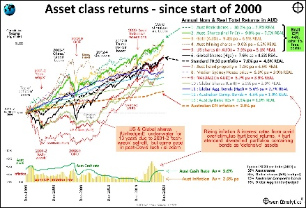
For a long-term perspective on asset class returns -
For my latest monthly market snapshot -
A note on data sources:
Australian shares:
- From 1980 – ASX All Ords accumulation index
- 1958-1979 - Sydney All Ordinaries
- 1936-1957 - Sydney 34 Ordinaries
- Before 1936 - Sydney Commercial & Industrial Index
- Before 1979, total return series use the Adjusted Lamberton dividends series.
Australian inflation:
- From 1960 – CPI, ABS 6401.0
- 1921-1960 – CBSC ‘C’ series Retail Price Index
- 1861-1921 – AHS Ch 12, Table PC-30
US share market:
- From 1950 - S&P500
- 1871-1950 - CRSP, Shiller/Yale.
US inflation:
- From 1913 – US BLS
- Before 1931 – Shiller/Yale
All returns are before fees, costs, and taxes.
IMPORTANT - Please refer to the disclaimers and disclosures below.