The world is a very different place for investors since the start of Trump’s first term eight years ago. Part 1 highlighted dramatic changes in the shape and distribution of global growth. Today we look at big changes in government spending, deficits and debts. Key outcomes:
-
-
- Governments have expanded in size everywhere – but not in the US or Australia.
- Budget deficits are worsening almost everywhere.
- Government debts have ballooned.
- Likely pressure elevating interest rates and bond yields – in the US and globally.
These big changes in the US and the world mean a new set of challenges for Trump’s second term, and for investors.
(Here is a link to my Report Card on Trump 1.0 -v- Biden, including comments on Trump’s policies for his second term).
1 – The size of Government has expanded everywhere – except the US!
Government spending has increased everywhere, but that is mostly due to the dramatic return of inflation globally. Even after inflation in each country, government spending in real terms still has expanded everywhere.
But economies have also grown at the same time, so the best measure is the size of government spending relative to the total economy in each country.
Here is the position in the same selection of countries/regions as in Part 1. The left side of the chart shows general government spending as a proportion of GDP. For each country, the first bar (light blue) is 2016 (immediately before Trump’s first term), and the second bar (dark blue) is the most recent annual or annualised data.
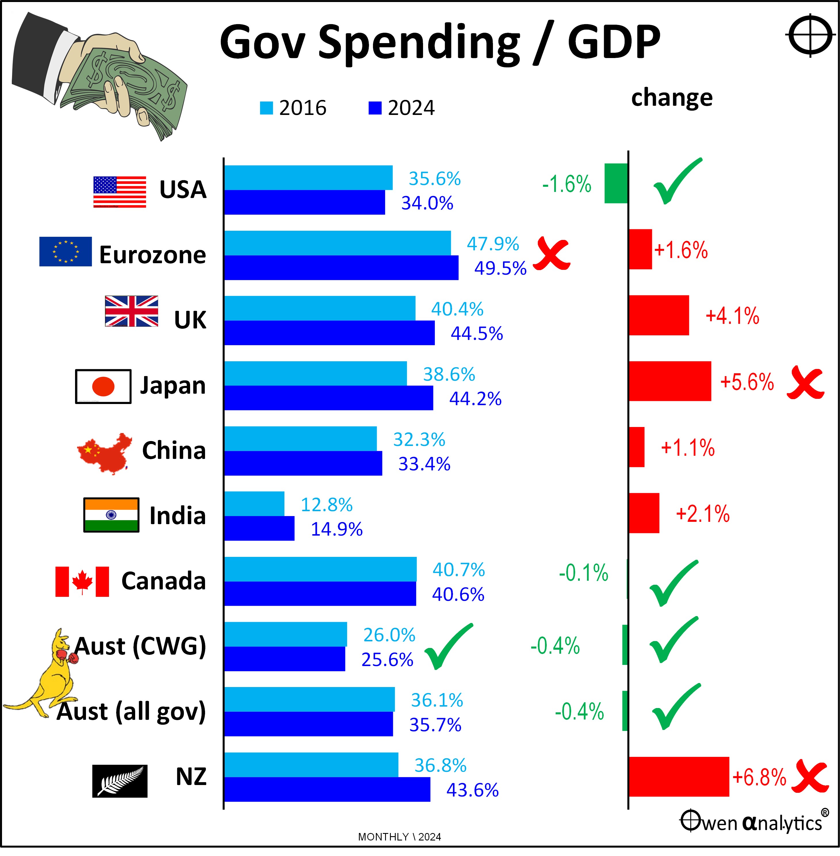
On the left side of the chart, India has by far the smallest government sector relative to its overall economy. But that is half the problem in India – chronic underspending on essential infrastructure to support development and growth.
At the other end of the scale is Europe with the largest government sector. In Europe, the government IS the economy. There is very little room left for business. And the chart shows spending just by national governments. On top of that is all the other layers of government - state, provincial, regional, local governments, and it also doesn’t include the over-arching supra-national European layer of government on top of all that.
For Australia I have included two sets of bars – one for Commonwealth government, and one for all levels of government (Commonwealth, State and local). We can see that our national government spending is the lowest (apart from India) in the world. Even Australia’s government spending across all layers of government is still lower than the national government spending of the other countries (except India).
We may complain about the interference and waste of our government here, but it is a lot worse just about everywhere else in the world!
Changes in the size of government
The right side of the above chart shows the change in the size of government (relative to GDP) from 2016 to now.
The US is a surprising winner here. Despite Trump’s Covid stimulus spending during the first four years, and Biden’s enormous spending spree on a host of massive programs over the past four years, the US economy has grown at even greater rates than government spending, so government spending relative to GDP has actually declined. That is a big tick for the US of A.
Australia has been the same story – relatively small and declining size of government over the past eight years. In Australia’s case, one contributing factor was that 2016 was a big deficit year in Australia due to poor mineral export revenues in the commodities collapse caused by China’s economic slowdown to 2015.
The other factor in the case of Australia has been the recent couple of years of government surpluses (next section below). So Australia’s starting point (2016) as just bad luck, and the most recent year (2024) was just good luck.
Canada has had a similar effect, but the size of government there is almost on the scale of Europe.
Banana republics (or in our case iron ore, coal, gas) are especially exposed to luck. We have no control over the demand, volumes, or prices of the raw commodities we sell.
2 – Government deficits are worse everywhere – except in Australia
The second chart shows the government balance – ie budget surplus or deficit outcomes – relative to GDP, in 2016 versus 2024.
The left side shows the levels in 2016 and 2024, and the right side shows the change over the period. Bear in mind that 2016 was well before Covid, so the 2024 figures reflect the new post-Covid philosophy that governments can and should throw money at every possible problem, with little thought of how, when, or who will pay it back some time in the distant future.
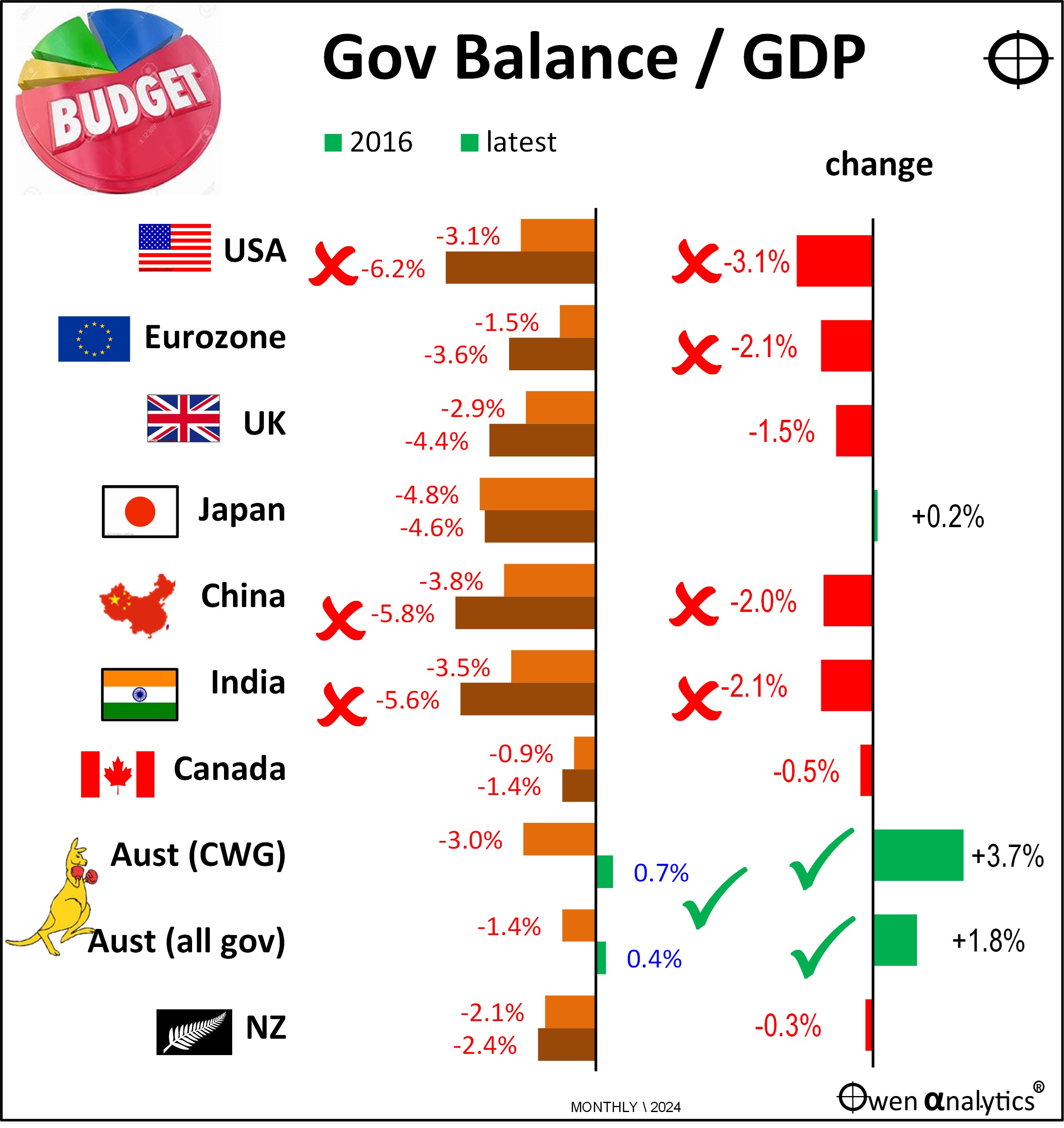
The worst performers where the US, which is still running 6% deficits, up from a 3% deficit in 2016. China and India have also increased their deficits since 2016 and are running large deficits now. In both cases, their problems are not merely cyclical, but are structural and probably terminal, due to their deteriorating demographics. (see Part 1)
Australia scores the only green ticks on the chart. However, as noted above, the government surpluses in 2024 are the result of windfall minerals revenues from unusually high levels of export volumes and commodities prices (China), and also the 2016 start point deficits were also the result of unusually low export volumes and prices (China slowdown).
So the green ticks for Australia are simply the result of bad luck (2016) turning into good luck (2024). The surpluses in 2023 and 2024 are forecast to return to big deficits from 2024-5 onward, because export prices and volumes have already fallen back.
However, I am not so pessimistic. Treasury and economists are notoriously bad at forecasting anything!
3– Government debts are ballooning everywhere – except in Europe
Government debt to GDP ratios have been worsening almost everywhere:
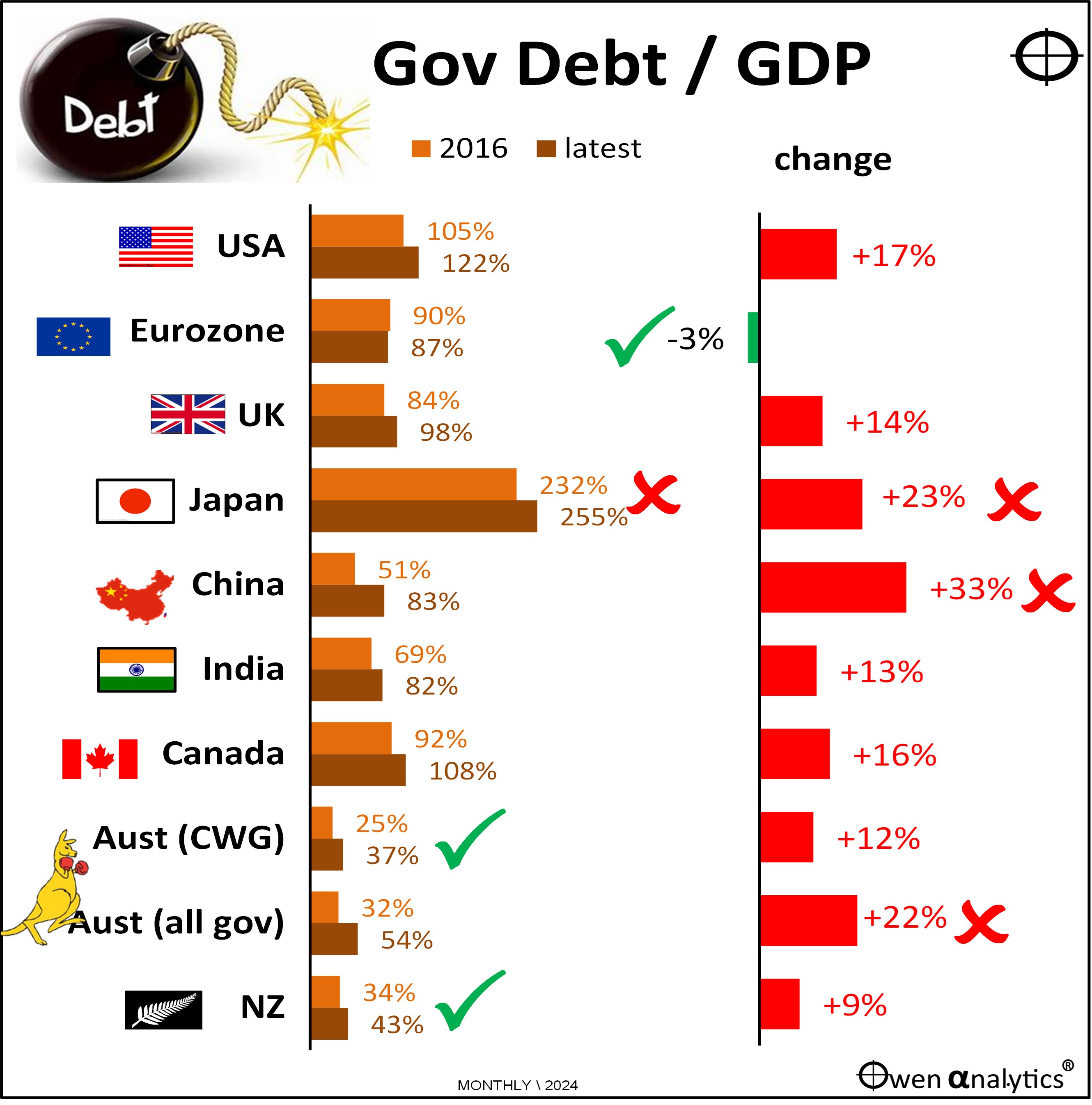
The right side of the chart is a sea of red – indicating rising debt to GDP ratios. The only exception is Europe, which remains very much a North-South thing: the frugal North (Germany, Austria, Netherlands, Denmark, Sweden, Norway), supporting the profligate ‘PIIGS’ (Greece, Italy, France, Spain, Portugal, but notably Ireland has been the stand-out improver).
Japan still has the highest levels of government debt (to GDP) in the world, and the ratio is still growing rapidly, made worse by economic stagnation – ie debt is still growing but the economy is not.
(Note that these are gross debts. Net debts are often much lower – eg Japan’s net debt is only half the level of gross debts, and is not much higher than the net debt in Italy France or Spain. Gross -v- Net debt is another story for another day!)
Australia’s government debt levels (Commonwealth, and even for all levels of government) remain among the lowest in the world, even after recent governments have used the windfall surpluses to increase spending rather than pay off debt.
Some implications for investors
This global picture of expanding governments, worsening government deficits, and ballooning debts have several serious implications for investors everywhere:
- US government debts are probably going to keep expanding rapidly, putting upward pressure on bond yields, especially if Trump somehow heavies the Fed into keeping cash rates lower than what would be required to kill inflation. A lower cash rate now would mean higher bond yields now and higher cash rates later.
- Expect a continuation of regular ‘debt ceiling’ crises in the US.
- Higher US interest rates and bond yields set the pace for the rest of the world.
- Higher US interest rates and bond yields will also probably support the US dollar, increasing the pressure and likelihood of Trump’s tariffs to assist US industries.
- In the US, Trump is starting behind the 8-ball with his plans for tax cuts and spending programs to support the re-build American manufacturing. His radical plans to cut government spending by one quarter or one third are probably not going to be achieved.
- Trump is likely to have some success in cutting red tape and reducing regulation in the US, probably as a focus on cost-cutting in government. This, along with his planned tax cuts, could invigorate US businesses, and perhaps accelerate the global shift for companies and capital back to the US.
- Governments everywhere have abandoned any notion of ‘fiscal responsibility’ (ie balanced budgets over a cycle). This is likely to fuel inter-generational conflict where ageing populations increase their political clout at the expense of the young who will bear the burden of higher debts.
This will make Trump’s second term all the more interesting and fascinating to watch and navigate investors through!
Please let me know if you agree or disagree on anything!
‘Till next time – happy investing!
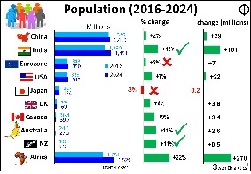
Part 1 outlined some big picture changes in the world since the start of Trump’s first term – see
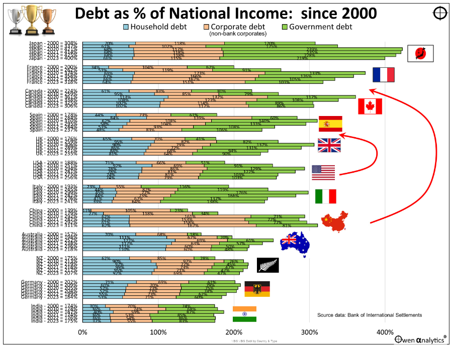
For a bigger picture on the rise of government, corporate, and household debts in a range of countries, see:
Here is my report card on the main outcomes under the Trump and Biden presidencies, and comments on Trump’s policies for his second term, see:

For my current views on asset classes and asset allocations (I am still bullish on US/global shares)- see:

A note on data sources: For stats on GDP, government spending, deficits, and debts I use various sources, mainly OECD, World Bank, IMF. RBA and ABS for Australia. St Louis Fed, NBER, BLS for the US. NZ Treasury for New Zealand. Also some secondary sources like Trading Economics.