It has been eight years since the start of Trump’s first term. Eight years may seem a short time in the grand scheme of things, so it is easy to assume that not much of the ‘big picture’ has changed for long term investors.
But there have been some big changes in the world that impact investors everywhere.
In Part 1 today I look at growth in the economic pie, and where is it being generated. Here are some highlights of changes since 2016:
-
-
- There are 600 million more people in the world. That is more than were added in the entire 19th century!
- Populations are aging everywhere, especially in China and Canada.
- The global economic pie is an incredible US$10 trillion larger (and that’s adjusted for inflation).
- The US has been the star – generating the lion’s share of global growth.
- The US is the only major economy growing faster now than in 2016. Everywhere else has slowed.
Big changes mean some big opportunities, and shifts in thinking and strategy!
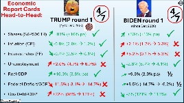
(Here is a link to my Report card on Trump 1.0 -v- Biden, including comments on Trump’s policies for his second term. Today’s story is about how the world has changed fundamentally under Trump and Biden).
1 – There are 600 million more people in the world today
More people were added to the world population in the past eight years than were added during the entire 19th century, or during the first one third of the 20th century. 600 million more people mean 600 million more consumers generating revenues and profits for businesses.
The world population has grown by 8% over the past 8 years. Here are the growth rates for the main countries:
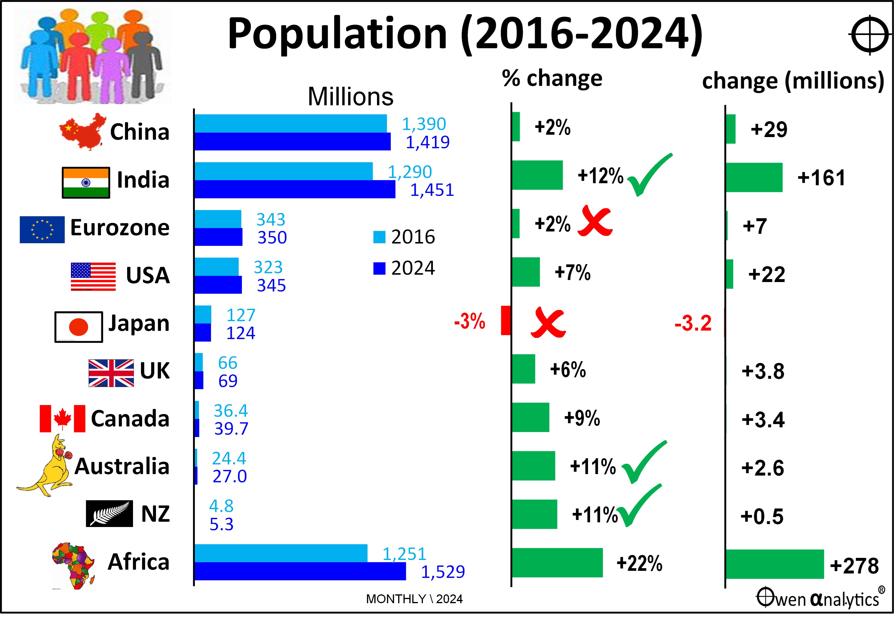
Where are these 600 million extra people? 40% are in Africa and 23% are in India (right section of chart).
The biggest gainer in numbers and percentage terms was India, with +12% population growth in the past 8 years (middle section of chart).
There have been two historic milestones on the population front. The first is that India has just over-taken China as the most populace country on earth for the first time in about 350 years. (India was more populous for thousands of years before China overtook it in about the year 1700, early in the Qing Dynasty).
The second is that China’s population has stalled and has started to decline for the first time since Mao’s disastrous ‘Great Leap Forward’, but this time the decline is unstoppable. This has been a big psychological boost to India, while China is losing the battle to overcome the effects of Deng Xiaoping’s ‘one child’ policy (1980 to 2016), plus low consumer confidence, with declining housing values and wages, and rising unemployment and unrest.
China is now heading down the same demographic path as Japan, where the population has been shrinking since 2011, and the rate of decline in Japan has actually been accelerating.
Europe is also looking sick (on many fronts). The only way out of Europe’s stagnation is immigration, but that has stalled due to populist, nationalist, xenophobic backlashes all across the region. This is a long term issue.
Australia and New Zealand remain at the top of the table on population growth among rich the world countries, mainly due to high immigration rates.
Also posting strong growth were USA and Canada. If Trump and the US military are successful in deporting the 11 million or so ‘illegals’, that would decrease the US population by 3%, although it is unclear to what extent these so-called ‘undocumented’ persons are counted in the official numbers. If the deportations plans are even partially achieved, that would have serious implications for wages growth, price inflation, and interest rates in the US and around the world. My guess is that Trump’s deportation plans will be about as successful as his ‘Build the Wall’ plan last time.
2 – But Populations are ageing everywhere – fast
Although the overall world population is still growing at a relatively fast pace, the problem is that most of the population growth is in older age groups.
The left side of this chart shows that Japan and Europe have the oldest populations, while India is the clear winner, followed by New Zealand and USA.
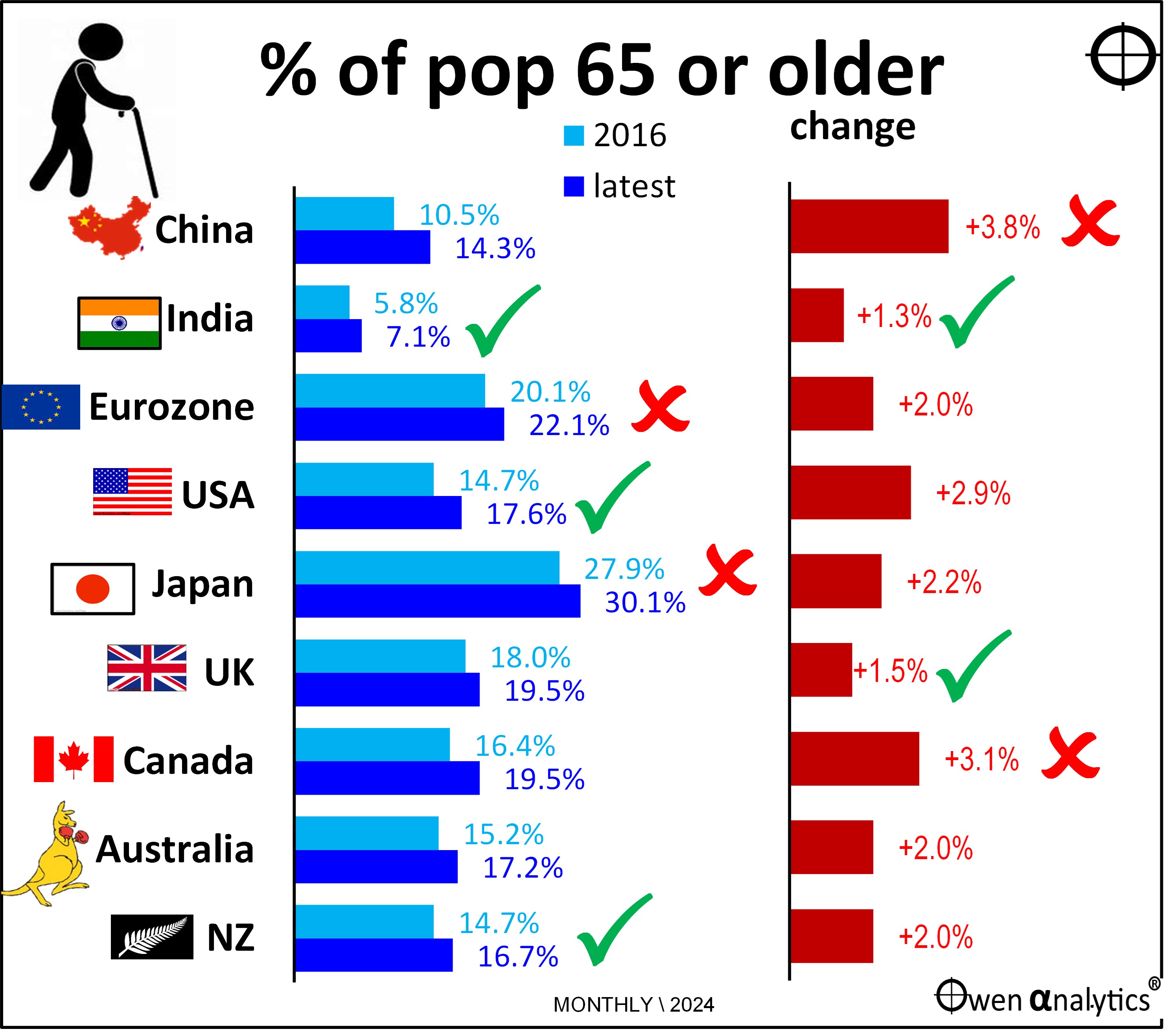
On the other hand, the right side of the chart shows the fastest movers – with China and Canada aging the mostly rapidly. India and the UK have the lowest rates of increase. The UK’s good performance is due mainly to immigration.
Australia and NZ also have relatively good (low) rates of increase, thanks to their immigration rates targeting young workers.
This is another unstoppable global trend. For workers it means longer working lives for more people (to save more for a longer retirement). For governments (and bond investors) it means more political pressure for pensions and benefits, which will probably means rising deficits and debts, more bond issuance, and upward pressure on yields.
Higher aged care and medical costs should mean greater opportunities and markets for healthcare companies, but this prospect has been built into the chronic over-pricing of the entire sector for many years.
3 – Global economy now 10% larger – that’s US$10 trillion more income
The overall global economic pie (total value of world output and incomes) is now 10% larger in real (ie inflation-adjusted) US dollar terms than it was in 2016. That’s US$10 trillion more aggregate output and incomes (the equivalent of about six Australias added over the period, or almost one Australia per year).
10% growth is an extraordinary result given the period included the sharpest and deepest global economic contraction since the 1930’s Great Depression, plus inflation rates and aggressive interest rate hikes not seen in a generation.
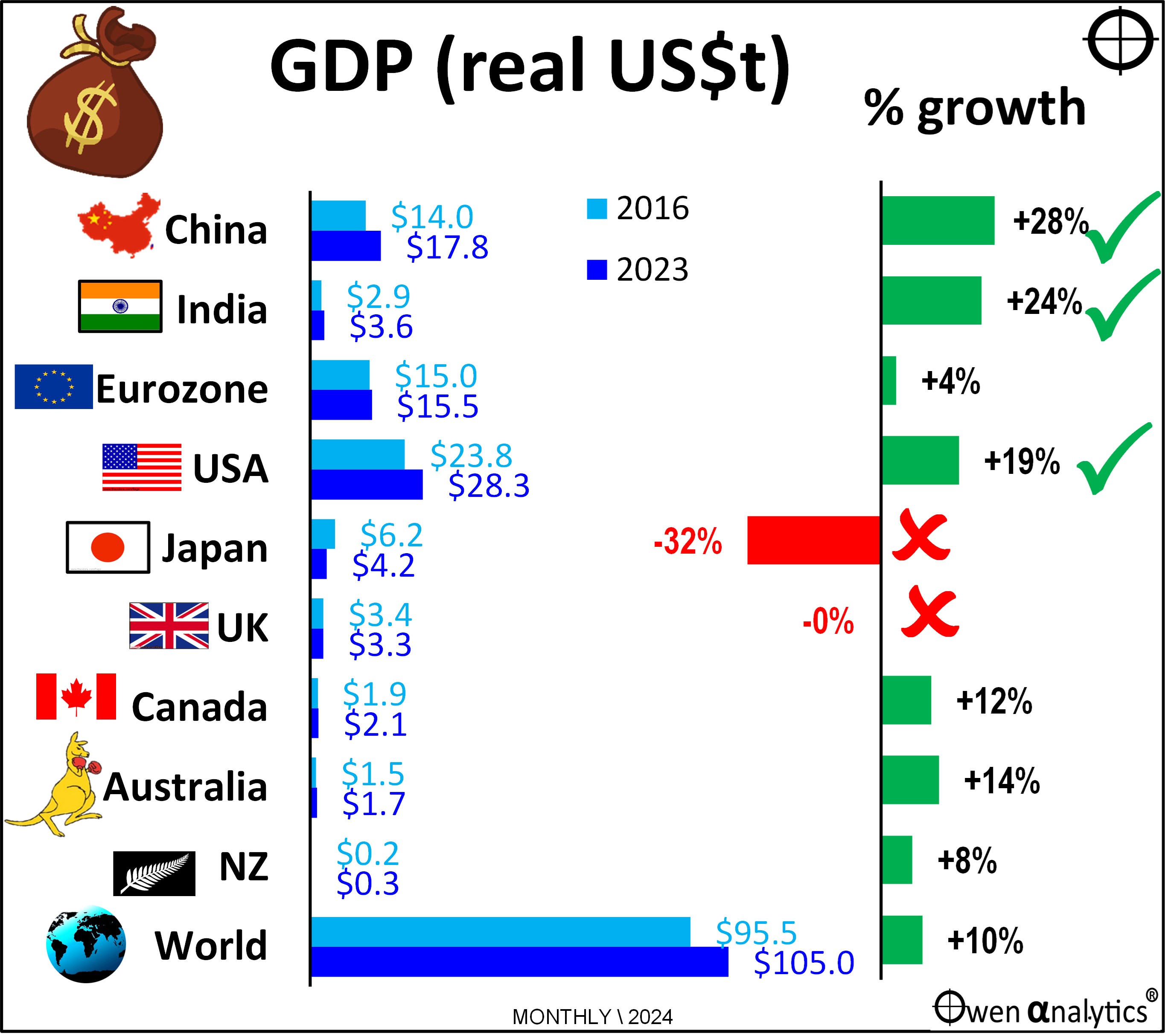
China has grown at the highest rate overall, despite widespread doom and gloom over China’s extended Covid lockdowns, the collapse of its property / construction / finance bubble since 2021, and escalating trade wars since 2018.
India comes in a close second behind China with the next highest growth rate of 24% over the period, but the US is not far behind at a rather healthy 19% growth over the period.
Japan posted big negative growth in real US dollar terms for the period mainly because of its collapsing yen. Japanese people have more yen in their pockets, but the yen as lost a quarter of its value in US dollar terms since the end of 2016, so the Japanese are a lot poorer in global terms, thanks to the government’s deliberate trashing of the yen.
Likewise, the Japanese share market is up +100% in yen terms since the end of 2016 (not as good as +160% for the US market but better than Australia’s +50%), but a quarter of those gains for foreign investors like us are lost because of the collapsed yen.
4 – Follow the Money! – USA is the big winner
While the above chart shows the growth of the economic pie in each country in percentage terms, the next chart below the growth in dollar terms – ie real (inflation-adjusted) US dollars. This shows where the increases in actual money has been generated.
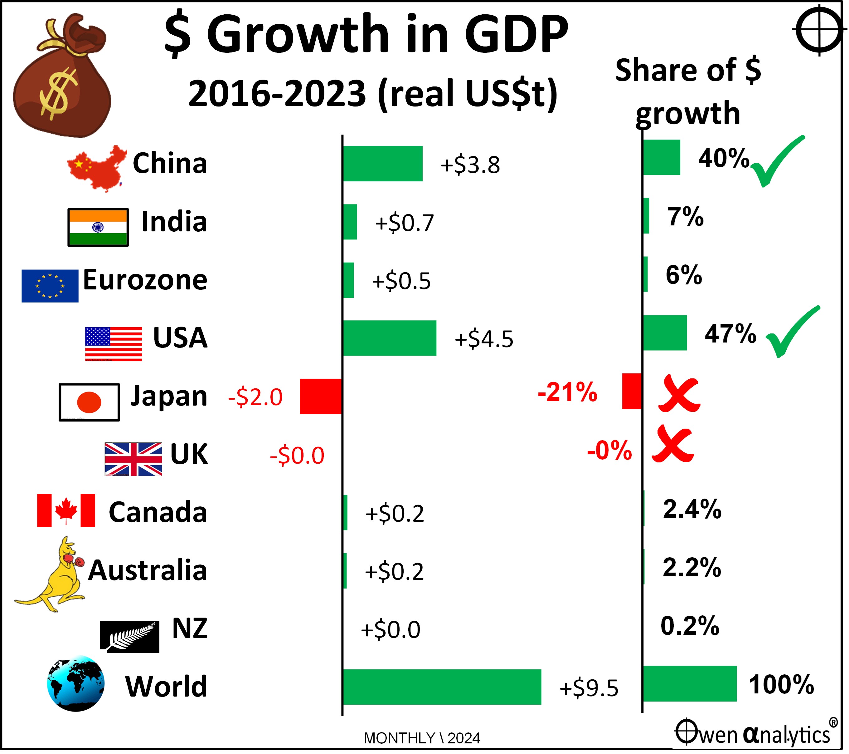
The big winner has been the US, which generated nearly half of the entire increase in total world output and incomes since the end of 2016, despite the US having only 27% of world GDP, and just 4.2% of the global population.
Second place is China – with a healthy 40% of the increase in total increase in world output and incomes since 2016. This is also greater than its 17% of world GDP, China also has 17% of the world’s population.
Australia accounted for a very respectable 2.2% of the increase in total world output and incomes since 2016, despite having only 1.6% of world GDP and a tiny 0.3% of the global population.
5 – US the only country to increase its economic growth rate
Remarkably, the US has also been the only major country to have increased its GDP growth rate since 2016.
The left side of the next chart shows economic growth rates for 2016 (light blue) and each country’s most recent annualised growth rates (dark blue, to September or June 2024). For this chart I use real growth rates in the domestic currencies of each country because this is how countries generally measure themselves internally.
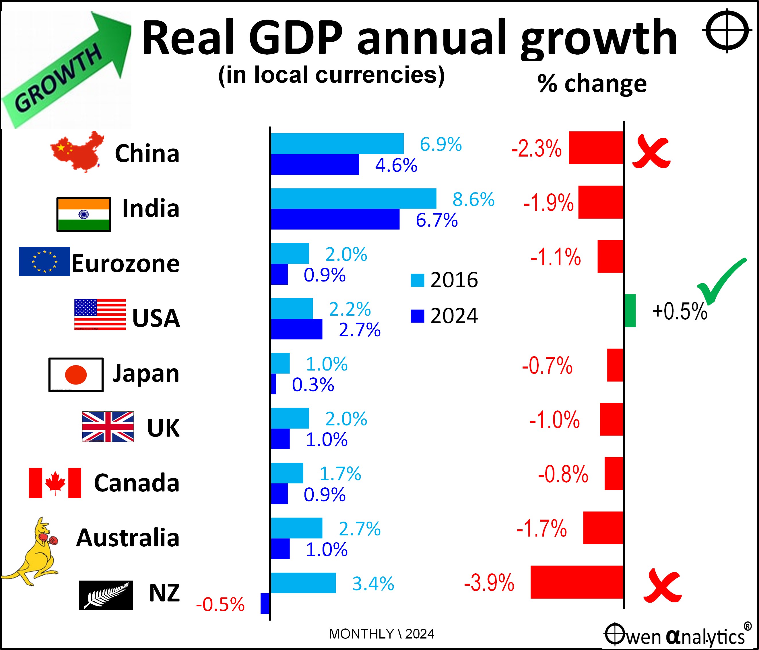
While China and India’s economies are growing at quicker rates now than the US (left side of the chart), their rates of growth have declined since 2016, like every other country on the chart. The change in the growth rate from 2016 (light blue bar) to 2024 (dark blue bar) is highlighted in the right side of the chart.
Of the countries covered here, only USA is generating higher growth now than in 2016.
The big losers have been China (which is still claiming 4.6% growth this year (but nobody has any faith in the numbers), and New Zealand which is in recession.
Despite all the media and economists' constant fear-mongering predicting US and global recessions in 2022, then again in 2023, and again this year, the US economy has remained relatively robust.
NZ is the only country here that is contracting. However, Australia, Canada, UK, and Europe are all barely above zero growth and are teetering on recessions on some measures.
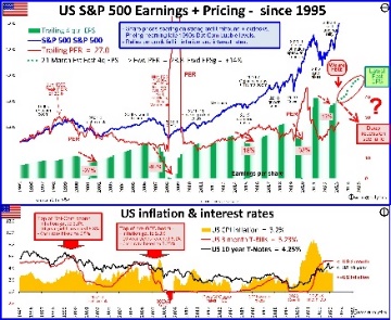
Sure the US share market is over-priced (but only half as over-priced as it was in the late 1990s at the top of the ‘dot-com’ boom before the 2001-2 ‘tech-wreck’ put an end to that!).
Fish where the fish are!
Investors are favouring the US because that’s where the lion’s share of global growth is (and I am still overweight US shares in portfolios).
In summary – there have been some major fundamental changes in the global economy over a relatively short period of just eight years since the start of Trump’s first term. Today’s story looked at some key aspects of the shape and distribution of growth between the main countries and regions.
The world is a very different place today – and the USA is even more entrenched as the centre of global growth. Now bring on Trump 2.0!
Look out for future more stories in this series where I cover other aspects of how the world has changed since 2016 – including inflation, interest rates, deficits, debts and other key issues for investors.
Meanwhile, for my report card on the main outcomes under the Trump and Biden presidencies, and comments on Trump’s policies for his second term, see:
For the state of the US market and the level of over-pricing - see:
For my current views on asset classes and asset allocations (this year I have been bullish on the US, and gold) - see:
‘Till next time . happy investing!
A note on data sources: For stats on GDP, population, demographics I use various sources, mainly OECD, World Bank, IMF. RBA and ABS for Australia. St Louis Fed, NBER, BLS for the US. Also some secondary sources like Worldometers and Trading Economics.