Key points:
- History shows that returns over all holding periods – even up to 10, 20 and 30 years - are little more than a coin toss. ‘Time-in-the-Market’ only works if you get your Timing right, which is mostly Luck!
- Finance textbooks and retirement calculators are based on nice, smooth, theoretical curves that assume constant ‘median’ returns over long periods.
- But in the real world, only ONE person in the entire population gets the median. Half will get MORE (sometimes a lot more) than the median outcome, and half will get LESS (sometimes a lot less). There have been decade+ periods of zero or even negative real returns.
- By the time you realise you’re in the unlucky WRONG half, it may be too late to adjust your strategy.
‘Time-in’ versus ‘Timing’
For decades a battle has raged between proponents of two of the main investment strategies:
- ‘Time-in-the-Market’ (or ‘Buy & Hold’, ‘Set & Forget’), versus
- ‘Timing-the-Market’ (or ‘Cycles & Valuations matter’).
Today’s story is about actual holding period returns from the US share market over time. (I do the same for the Australian share market in a separate story – are the results any different?)
The case for ‘Time-in-the-Market’ (or ‘Buy & Hold’, ‘Set & Forget’)
Proponents of ‘Time-in-the-Market’ argue that investors should not try to ‘time’ the market with tactical buying or selling (over-weighting or under-weighting) when the market is ‘cheap’ or ‘expensive’. Or even worse – trading.
Their advice is to just sit tight and hang on for the ‘long term’, ignore the inevitable booms & busts along the way, and your patience and inaction will be rewarded with decent CPI+ returns in the long run.
Warren Buffett once said in his 1991 Letter to Berkshire Hathaway shareholders
‘The stock market serves as a relocation centre at which money is moved from the active to the patient.’
Long term history
The time-in-the-market idea appears to be supported by long-term history. The broad share market in the US (and Australia) has generated annual real total returns (ie inflation-adjusted, including dividends) averaging around CPI+6.5% per year for more than a century, through all sorts of booms & busts, recessions, depressions, inflation spikes, deflation, political crises, world wars, military flare-ups, revolutions, fundamental changes in technology, society, tax regimes, monetary regimes, demographics, and a host of other changes in market conditions.
But the world changes
Throughout all of these massive changes in the world and in market conditions, the broad US and Australian share markets have kept on delivering good CPI+ returns, underpinned by continued growth in economies, and aggregate corporate profits and dividends.
The world today is radically different from what it was a hundred years ago, and in a hundred years’ time it will be just as different again, in whole new ways we cannot even comprehend today, just like the last hundred years. If the US remains a vibrant, open, capitalist economy with pro-business, pro-growth governments, there is a good chance that companies on the whole, and share markets in aggregate, can keep generating similar kinds of returns in the future as they have in the past, through all of these changes in market conditions.
Historically, it appears that patience and passiveness has paid off, on average, anyway, over very long periods.
Active -v- Passive
On the other hand, probably the vast majority of investors who have tried to ‘time’ the market – by trying to ride the booms in the hope of getting out at or near the top, or trying to hit the jackpot by picking the next Google or Amazon or Nvidia - have ended up worse off than if they had just stuck to a simple ‘buy & hold’ strategy with low-cost market-wide index funds.
Legendary US fund manager Peter Lynch said in his book (‘One Up on Wall Street’, 1989) -
“Far more money has been lost by investors preparing for corrections, or trying to anticipate corrections, than has been lost in corrections themselves.”
This applies also to ‘professional’ fund managers as well as ordinary investors. It is well known that the vast majority of ‘Active’ fund managers have under-performed passive index funds, not only in share funds but in every other asset class as well, in the US, Australia, and every other country where this is measured. For example, see S&P’s SPIVA reports (‘S&P Indices versus Active’).
(Peter Lynch was one of the very rare exceptions to this general rule of active fund under-performance, and I recommend his book as mandatory reading for every investor. However despite the accolades and his well-earned fame, it is important to remember that Lynch only managed Fidelity’s Magellan fund for 13 years before retiring on top, just before the early 1990s recession. You and I need to invest for a long longer than 13 years!)
While ‘professional’ active fund managers almost universally destroy value, numerous studies have shown that individual investors do even worse in aggregate.
You can’t spend ‘relative’ returns, you can only spend actual dollars
The ‘active versus passive’ debate has well and truly been won by ‘passive’. Passive ‘Time-in-the-market’ index funds invariably beat ‘active’ management, amateur and professional.
Bet here's the problem. That is about relative returns (portfolio returns relative to a market index).
As an investor, I am not interested in relative returns (ie relative to a benchmark index, or relative to passive). As an investor I am interested in the actual return in actual dollars – ‘Am I on track to meet my $goal?’, ‘Do I have enough money to support my lifestyle/expenses?’, ‘Can I afford to buy xyz?’, ‘Should I save more, or spend less?’, etc.
The main problem with ‘Time-in-the-market’
The main problem with the ‘Time-in-the-Market’, ‘Buy & Hold’ approach is that passive ‘Buy & Hold’ returns over long holding periods can vary greatly – from massive gains to devastating losses. Unfortunately, a lot of it comes down to luck and timing.
Bottom line – ‘Time-in the Market’ only works if you get the Timing right – which is mostly luck.
Finance textbooks talk about historical ‘median’ and ‘average’ returns, and financial planning software and online retirement calculators show returns and projections as nice, neat straight lines and smooth curves based on those textbook average and median returns. Unfortunately, in the real world there are no straight lines or smooth curves!
Textbook ‘median’ and ‘average’ returns sound good in theory, but only one person in the entire population gets the median. Everybody else either gets more (and sometimes a lot more), or they get less (and sometimes a lot less) than the median.
Where you turn out to be on that wide spectrum of outcomes from very good to very poor, comes down to luck and timing.
You could patiently ‘buy & hold’ a broad share market index fund for 10 or 20 or even 30 years, hoping for a decent textbook-like, historical average return, but in real life, you could end up with massive, unexpected gains, or zero returns, or even big losses. Even over decades.
In the real world you will never get the average or median return – you will always get a ‘surprise’ – either positive or negative. If you rely just on ‘Time-in-the-market’ it’s essentially a coin toss which return you end up with.
History shows that returns over holding periods of even 10, 20 and 30 years vary greatly around the 'median'.
Within that wide distribution of outcomes, the actual return you get is little more than a coin toss.
Today’s chart shows the distribution of real total returns (ie adjusted for inflation, and including dividends) from the US share market over different holding periods – from 1 day to 30 years. (Real total returns are the most important measure of returns for long-term wealth generation and retirement planning).
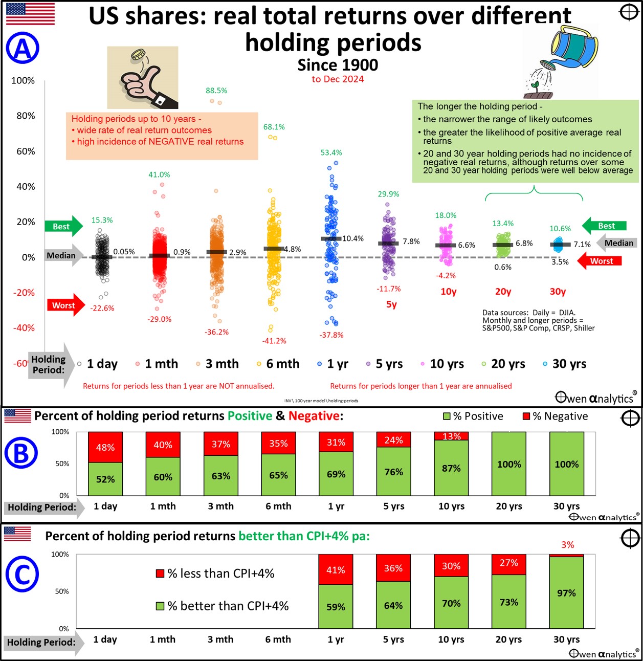
Returns for periods shorter than one year are not annualised, but returns for periods longer than one year are annualised. Returns shown are for all periods from 1900 to the end of December 2024. Daily moves use the Dow Jones Industrial Average, but periods of one month and longer are based on S&P500, S&P Composite, CRSP. (See notes on data sources at the end of this story.)
The coloured dots show the actual returns for each holding period since 1900. Also highlighted on the main chart are the median (middle) return (black bars), and the highest and lowest returns per holding period.
Short holding periods are a coin toss
Daily
There are more than 30,000 daily moves (black dots) in the first set of dots on the chart (black dots to the far left) – ranging from the best single day (+15.9% on 15 March 1933 after FDR’s national bank holiday/closure), to the worst single day (-22.6% on 29 October 1987).
Monthly
There are 1,500 monthly moves (red dots) that are spread over an even wider range of outcomes – from the best month (+41% in August 1932, rebounding from the bottom of the Great Depression), to the worst month (-29% in September 1931, on the slide into the Great Depression).
Quarterly
Quarterly moves (orange dots) cover the widest range of all holding periods – from the best quarter - an incredible +88.5% in September quarter 1932 (Depression rebound), to the worst quarter (-36% in June quarter 1931). (I only use calendar quarters for this exercise.)
Six-month periods (yellow dots) also show a very wide range of outcomes, with the best and worst six-month periods also occurring in 1932 and 1931 respectively.
Calendar years
Calendar year returns (blue dots) also have a very wide range of outcomes – from the best year (+53.4% in calendar 1953) to the worst year (-37.8% in 1931). Remember that these are real (after inflation) returns, so the nominal total return of -44% in 1931 was actually improved by -9% CPI deflation in that year!)
Incidence of positive and negative returns
Intuitively, because of the volatility of the share market, holding shares over short periods, say up to a year, is essentially a coin toss, with around half of all dots above the line (positive) and around half below (negative).
Chart B shows the actual proportion of outcomes that were positive (green bars) and negative (red bars) for each holding period.
Short-term holding periods are certainly fascinating, but we mainly want to look at returns over longer holding periods – which is the basis of the ‘Time-in-the-Market’ or ‘Buy & Hold’ strategy.
Long-term wealth & retirement portfolio planning – the ‘4% rule’
The standard starting point for long-term wealth generation and retirement planning is to design a portfolio that generates an average of CPI+4% per year, so you can have confidence to withdraw 4% of the balance per year and have a pretty good chance that your portfolio will outlive you, maintaining its real value, and the real value of withdrawals, through all sorts of market conditions along the way.
(There have been hundreds of reports written about this ‘4% rule’, and it is another topic for another day. The ‘4% rule’ does have some merit, and is a pretty good starting point, but there are a lot of variables that affect whether it will actually work in different kinds of real world conditions.)
Chart C below the main chart shows the proportion of returns for each of the holding periods that managed to achieve this ‘CPI+4% rule’. For example, in the case of 10-year holding periods, the ‘median’ 10-year holding period return was above 6%, but 27% of 10-year holding period returns were below CPI+4%.
That means more than a quarter of all 10-year holding periods failed the basic CPI+4% retirement portfolio test. That is just too much of a coin toss for my liking. It relies too much on luck (lucky timing).
An advisor does not want to have to call up 27% of their clients and tell them: “I’m sorry, but you just weren’t one of the lucky ones! You need to either cut your living expenses or go back to work!”
Huge variability of 10-year holding period returns
Let’s start with 10-year holding periods (pink dots on the main chart) because 10 years is what finance theory calls ‘long-term’. (For example, every corporate finance valuation model in the world starts with a discount rate based on the benchmark 10-year government bond as the so-called long-term ‘risk-free’ asset.)
Share funds are required to warn potential investors that they are only suitable for investors with ‘time horizons’ (intended holding periods) of at least seven years or ten years. Why? Because even a diversified basket of shares needs at least seven to ten years to minimise the prospect of poor returns. But does it?
Surely 10 years is a long enough holding period to provide some level of confidence about likely outcomes?
Unfortunately, even 10-year holding period returns are little more than a coin toss!
Here’s why.
Over the whole period since 1900, the median 10-year holding period real total return from the US share market was a rather healthy 6.6% per year above inflation (black median bar in the middle of the pink dots on the main chart).
That’s sounds great (4% rule – tick!), but there is a big problem. Look at the wide dispersion of pink dots around the median. Each pink dot is an investor that started their holding period in a different year. Some were lucky, some weren’t.
Although the median 10-year holding period was a healthy 6.6% pa, the actual 10-year return each investor received depended very much on which particular 10-year period they happened to have. The scattering of pink dots shows the returns over the different 10-year holding periods between the start of 1900 and end of 2024.
(For his exercise I include holding periods covering only whole calendar years, not holding periods starting every month or every day, etc. So, in the period since 1900, there have been 116 ten-year holding periods starting at the beginning of January each year: ie. Jan 1900 to Dec 1909, Jan 1901 to Dec 1910, Jan 1902 to Dec 1911, etc)
The problem with the median is that it is achieved by just ONE person. The single middle investor gets the ‘median’ return, EVERYBODY else gets a higher or lower return than the median. And it can be a lot higher or a lot lower.
The best 10-year period for US shares was 1919 to 1928 (ie January 1919 to December 1928) during the incredible 1920s boom, when real total returns averaged CPI+18.0% pa, or +424% in total – and that’s after inflation. (Spoiler alert: we all know what happened after 1928!)
The worst 10-year period for US shares was 1911 to 1920, when real total returns averaged minus -4.2% per year, or an accumulated loss of -35%. That’s a huge loss over a 10-year period, and a nasty surprise to someone who had read the textbooks, or online retirement calculators that said, ‘the US shares generated median 10-year returns of around 6.5%’.
They did, but that was only for the one, single, solitary, ‘median’ person! Everybody else got a different return – either better or worse, over a wide range of outcomes.
10-year holding period returns over time
Chart D below takes those pink 10-year holding period return dots in the main chart and spreads them over time to show when they occurred on a time line. The positive green bars in Chart D represent the pink dots above zero, the negative red bars are the pink dots below zero.
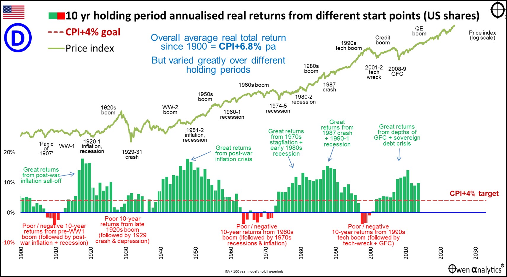
It highlights the significant number of 10-year periods of negative returns, and failing to achieve the CPI+4% target (maroon dotted line).
I have also included the price index so we can see the booms and busts, and this is the key to understanding returns.
Timing is everything!
Holding period returns are certainly sprayed around a ‘median’ as if they are a coin toss, but it is not just luck.
The periods of poor or negative 10-year returns all started in booms. If you buy in a boom (which is when most investors are tempted in, or even worse, tempted to gear up), you are going to get poor returns – even if you hold for a decade or more.
Conversely, the periods of great returns (high green bars) all started when prices were low in the depths of busts – highlighted in green text.
This is the key to achieving good returns – always go against (or at least don’t blindly follow) the crowd. Warren Buffett said it best – the aim is:
‘to be fearful when others are greedy, and to be greedy when others are fearful’. Berkshire Hathaway Chairman’s Letter, 1986 Annual Report.
That is the essence of ‘Timing-the-market’ – to understand market cycles and valuations, to do the opposite of what the crowd are doing. The crowd always panic-buys in the booms (FOMO – Fear of Missing Out) – pushing prices well above fair value supported by fundamentals. (‘be fearful when others are greedy’)
Then the crowd always panic sells in the busts that always follow booms (FOLO – Fear of Losing Everything), pushing prices well below fair value, which creates great bargain buying opportunities. (‘be greedy when others are fearful’)
The share market always swings from way over-priced / expensive, to way under-priced / cheap, and back. That is just basic human nature – fear and greed (or I prefer fear and envy – suggested by Warren Buffett’s offsider, Charlie Munger).
Huge variability of 20-year holding period returns
20 years is a much longer time – it’s more than half of most people’s retirement, so we would hope for more ‘certainty’ and less variability – ie less reliance on luck, and fewer surprises.
The median 20-year holding period also above 6% pa, but the actual 20-year return each investor received still varied greatly – ie still a lot of negative (and positive) surprises, and a lot of luck.
Best 20 years
The best 20-year period for US shares was 1980 to 1999 which included the 1980s deregulation boom and 1990s ‘dot-com’ tech boom. Real total returns averaged a very healthy CPI+13.4% pa, or +1,126% in total – and that’s after inflation. (Another spoiler alert: just like what happened after the 1920s boom, we all know what happened immediately after the 1990s ‘dot-com’ boom!)
Worst 20 years
The worst 20-year period for US shares was 1901 to 1920, when real total returns averaged just 0.6% per year. That’s virtually zero real total returns for 20 long years. That would also have been a nasty surprise for someone who had read the textbook statement that ‘US shares generate median 20-year returns of around 6.5%’.
Are 30-year holding period returns any less variable?
How about 30-year holding periods? – that’s all or almost all of a person’s ‘accumulation phase’, and all or almost all of their ‘retirement phase’.
The median 30-year holding period was also well above 6% pa, but the actual 30-year return each investor received still varied greatly. The longer the holding period, the narrower the range of outcomes, but the range of outcomes from different 30-year holding periods was still quite wide.
Best 30 years
The best 30-year period for US shares was 1932 to 1961 – ie from the bottom of the Great Depression (if you were brave enough to start in the very depths of depression when the market index was down -89% and pessimism was greatest), and through the Second World War boom, post-war inflation and then the post-war 1950s boom. For those who started in 1932, real total returns averaged a very healthy CPI+10.4% per year during the period. Tremendous reward for investing at the very bottom of the Depression and holding on through the War.
Worst 30 years
Unfortunately, the worst 30-year period for US shares was just 3.5% per year between 1902 and 1931. That was just half of the nice, neat textbook ‘long-term’ returns, and it was below the critical CPI+4% test. If you happened to retire in 1902 confident in a prosperous retirement in the midst of the euphoria of the peaceful and prosperous world in the new millennium, your lousy returns for the next 30 years meant you ran out of money, and/or had to dramatically cut back your spending. Your timing was just bad luck.
Time does not cure all ills
Investors who buy in a boom when prices are expensive are always going to get lower than average returns, no matter how long they wait, because they paid too much at the start.
In the property market there is an old saying: ‘You make your money when you buy’, and it’s the same with the share market and any other type of investment.
Boom-bust cycles and valuations
Textbook finance is based on the grand-sounding (and Nobel prize winning) ‘Efficient Markets Hypothesis’, which proclaims that every single asset in the world is fairly priced at all times, and always reflects a rational and logical assessment of all relevant information that affects the price.
The theory proposes that there are no irrational bubbles or busts because (a) every investor at all times has full and complete knowledge of every single piece of information relevant to the asset in question, and (b) that every investor bases their decisions solely on the rational assessment of that complete set of information.
Not only is all of that complete nonsense, it’s also downright dangerous, as it denies the existence of irrational booms and busts driven by human emotions.
In the real world, market pricing is almost NEVER fairly priced based on fundamentals. Markets ALWAYS lurch wildly from massive over-pricing/expensive levels (like now) to massive under-pricing/cheap levels, and back again. Always have. Always will.
In the real world, valuations, cycles and timing matter. From the tops of booms when pricing is expensive (ie now in 2025), future returns over ALL subsequent holding periods are going to be well below average, no matter how many decades you wait.
Conversely, from the bottoms of busts when pricing is cheap (like early 2009), future returns over all holding periods are going to be better than average.
‘stochastic’ nonsense
There are some retirement calculators that have moved beyond those nice, smooth median return projections and use fancy terms like ‘stochastic’ and ‘Monte-carlo’ techniques. These are just as flawed because they are based on the theoretical assumptions that market prices are ‘random’ and ‘normally distributed’. (I know - I teach this stuff!)
Unfortunately, in the real world, no prices in any asset class, in any country on this planet is, nor has ever been, nor ever will be, statistically ‘normal’ and ‘randomly distributed’. Why? Because financial markets are run by humans driven by wild, irrational emotions, not calm, rational logic. That always has been, and always will be the case.
The myth of ‘Dollar Cost Averaging’
Proponents of ‘Time-in-the-Market’ argue that long term accumulators (ie workers) can avoid the problems of booms and busts by ‘dollar cost averaging’ – ie investing a constant amount of money regularly (say $x per month from their pay) and increasing the regular amount for inflation and/or pay rises each year.
That way your constant, regular $x per month buys fewer shares when the market is ‘expensive’, and more shares when the market is ‘cheap’, and that should smooth out the booms and busts. (In Australia, the compulsory Superannuation system essentially does this by clipping a set percentage of all employees’ regular pay packet.)
‘Dollar Cost Averaging’ is certainly a great way to get people into a regular savings/investing habit, but unfortunately does NOT get around the problem of huge dispersion of return outcomes either side of the ‘median’. (Anybody who has actually done the work will know this).
Much still depends on when you happen to start investing, which is determined mainly by when you happen to have been born. However that is another story for another day.
What to do?
One we realise that financial markets work in wild, emotion-driven, boom-bust cycles, where actual returns depend largely on timing and luck, we need a way of ensuring that some of that lucky timing works in our favour.
The first step is relatively easy. It is to form a view on what stage of the cycle we are currently in. Is the market in over-priced, over-confident, euphoric, panic-buying, FOMO? Or is it over-sold, bargain-basement, over-pessimistic, panic-selling FOLO?
Wild booms and busts are much easier to see in hindsight than when you are in the middle of them at the time.
What stage are we in now (middle of 2025)? (You only need 1.3 nano-seconds of thinking music for that one!)
The second step is much more difficult. It is to learn how to control our own emotions and ignore the crowd. Better still, go against the crowd – or at least not blindly follow it.
In summary -
- Step 1 – understand market cycles and valuations – is relatively easy – I have been studying and writing about it for years.
- Step 2 – master our own emotions and actions – is much harder – I am still working on this!
I have been lucky
'Time-in-the-Market' works only if you get your Timing right. Most of it is luck of birth.
In my particular case, I just happened to be born in 1959 and therefore started working/saving in the early 1980s. Luckily, that was right at the start of a fantastic 20-year bull market for shares. Brilliant timing on my part! (thanks parents!)
By the end of the 1990s I had been in financial markets for 20 years – through the early 1980s recession, the mid-1980s takeover boom, the 1987 crash, late 1980s property/lending boom, the early 1990s recession, then late 1990s dot com boom. During those 20 years I got a fairly good understanding of how market cycles work. So I avoided the tech-wreck (actually floated a 'dot-com' right at the top of the crazy 'dot-com' boom - talk about lucky timing!), and got back in for the next big boom. Likewise for the GFC.
Timing is everything! Most of it was being born at the right time.
On the other hand, if I were born in early 1900s, I would have started saving/earning in the early 1920s, and probably would have been spurred on by easy gains in the 1920s, and lured into investing/gearing up big by the end of the 1920s (as many thousands were). I would have still been poor when I retired in the 1950s and would have had a very lean retirement and died broke in the 1970s.
Those neat theoretical 'medians' mask generations of winners and losers, based mostly on lucky or unlucky timing.
Timing is everything. I have been lucky so far. Long may that continue!
Stay tuned for my follow-up story in which I do the same holding period return analysis for the Australian share market. Will it be any different?
‘Till next time – safe investing!
Also, as a long-term Berkshire Hathaway shareholder, if I was only allowed to read one single report per year, it would be Warren Buffett’s Annual Letter to shareholders – here.
A note on data sources:
US share market:
- From 1950 - S&P500
- 1871-1950 - CRSP, Shiller/Yale.
- Daily - DJIA.
US inflation:
- From 1913 – US BLS
- Before 1931 – Shiller/Yale
All returns are before fees, costs, and taxes.
IMPORTANT - Please refer to the disclaimers and disclosures below